CASE STUDY
UX-led redesign for a local string band’s digital presence
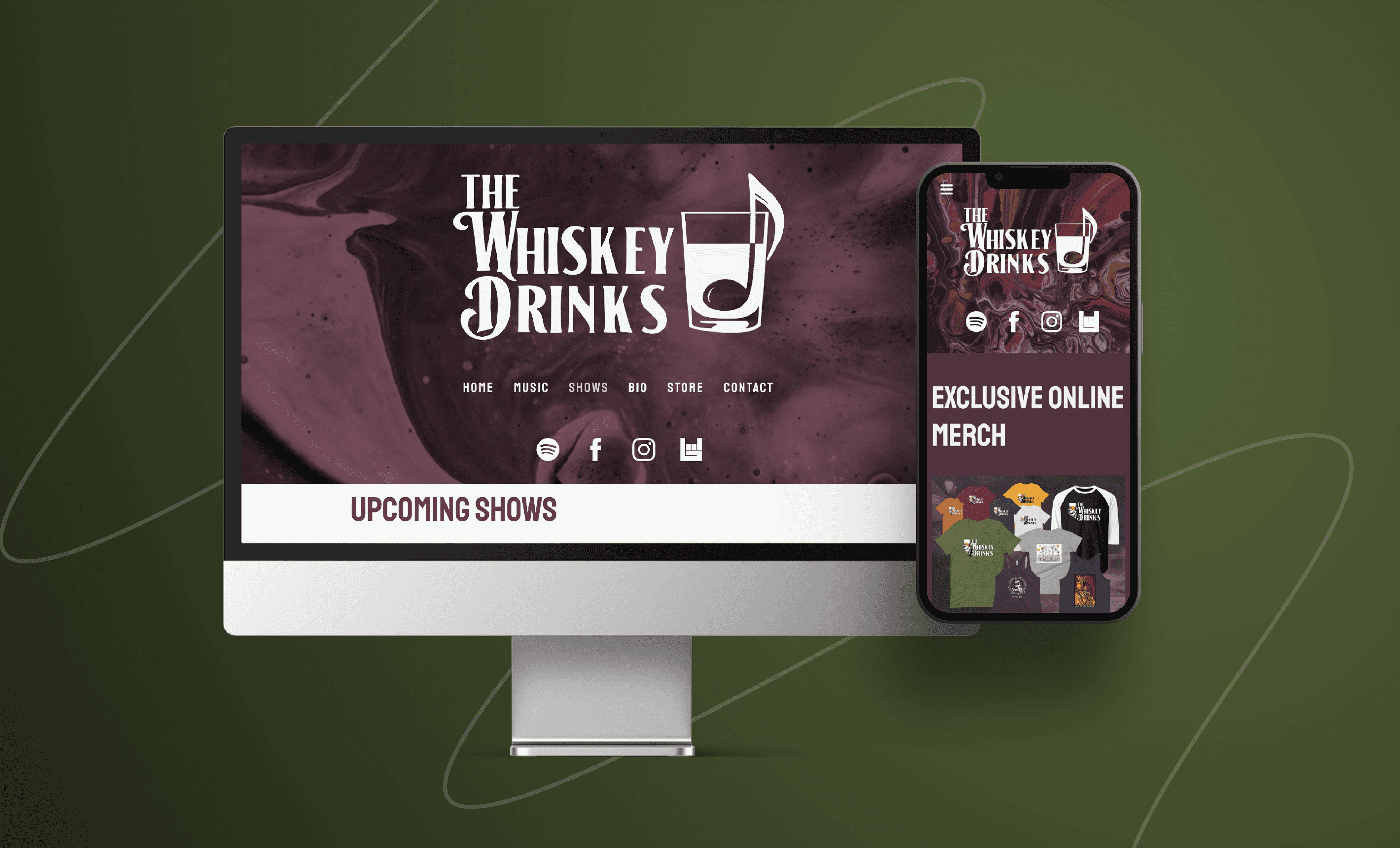
I transformed a one-page WIX site into a fully branded, responsive experience designed to grow fan engagement, bookings, and merch sales. From research to video production, I helped this band go from local favorite to nationally recognized act.
Client: The Whiskey Drinks (Americana string band)
Role: UX Designer & Project Lead
Duration: 2+ months, (2024)
Tools Used: Figma, Canva, Photoshop, iMovie, Bandzoogle, BandsInTown & Printful
The Problem
An outdated WIX site failed to represent the band’s identity, hurting their bookings and merchandise sales.
Goals
Showcase the band's identity through modern branding
Improve user experience for fans and booking agents
Boost engagement, bookings, and online sales
Solutions
Impact Highlights
600+ visitors in the first month
First-week merchandise sales > $150
National exposure (NPR, IMBA showcases, out-of-state gigs)
“It’s everything we wanted and more.”
— Don Gordon, Guitarist & songwriter
Conducted user interviews & surveys to identify issues with the band’s existing site and gather insights from multiple user groups.
Created a cohesive brand identity — logo, color palette, and visual style reflecting the band's tone and energy.
Built low- and high-fidelity wireframes focused on usability, multimedia engagement, and clear navigation.
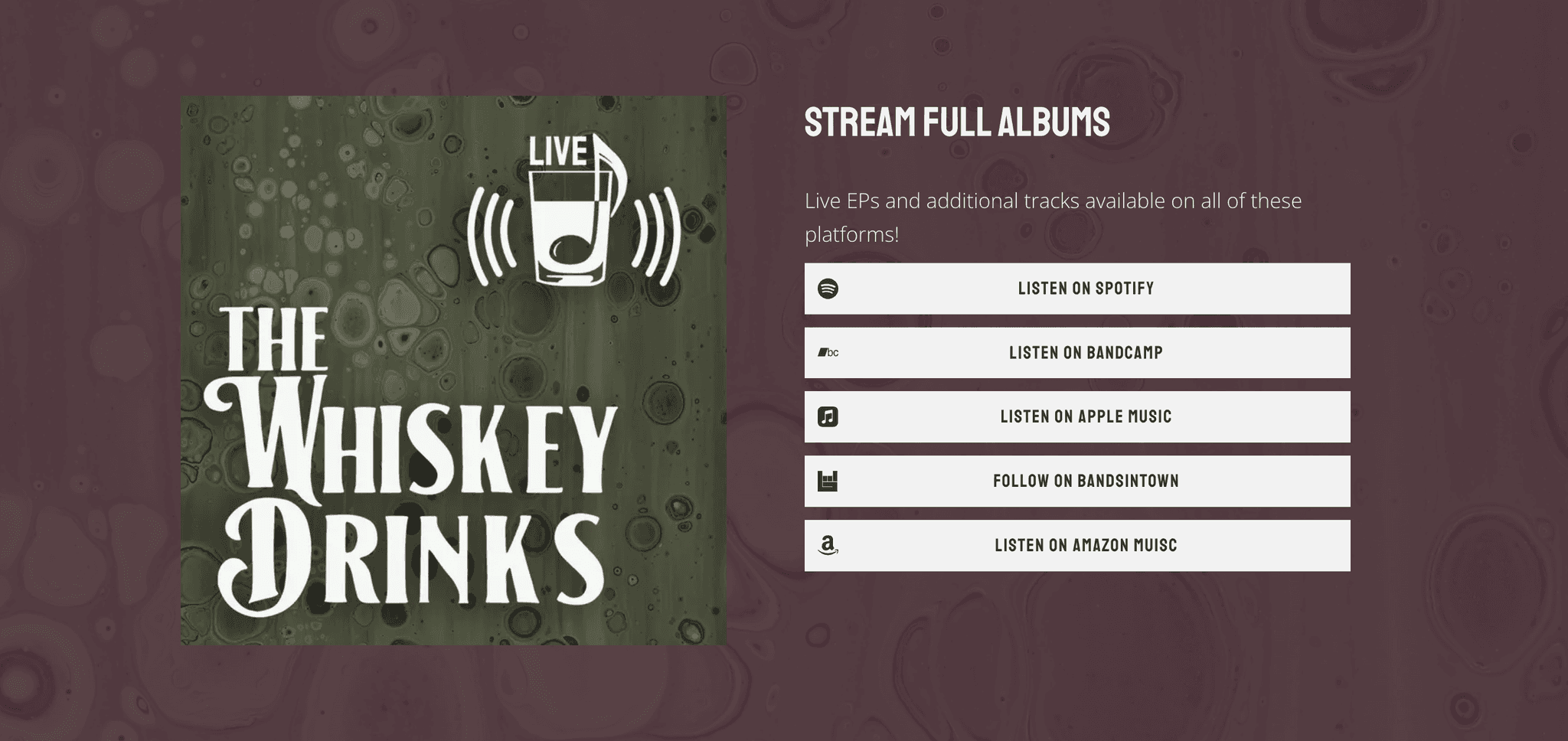
Integrated Bandzoogle, Printful, and BandsInTown to streamline events, merch, and music access.
Conducted usability testing with fans and industry pros; iterated based on real-world feedback.

Initial Client Meeting
I kicked off the project with an in-depth discussion with the band to align on goals, vision, and challenges.
Rather than simply fixing their outdated WIX site, I proposed a strategic redesign focused on user needs and brand identity.
A: Everything!!
Key Discovery Questions:
What frustrates you most about your current site?
Who are your primary users — fans, industry professionals, or both?
What are your key goals for your website?
Outcomes:
Cohesive Online Presence: Unified brand identity that reflects their music.
Fan Engagement: Easier access to shows, merch, and media.
Booking Support: Streamlined EPK and contact info for venue owners.
This initial alignment laid the foundation for a purpose-driven and visually compelling redesign.
Understanding the Audience
The Fans
People who follow bands, attend shows, & buy music and merchandise.
Industry Professionals
Local venue owners, booking agents, & talent buyers looking for local talent to fill their calendar.
To understand these two distinct user needs and validate assumptions, I conducted targeted user research through a mixed-methods approach:
📊
Designed and distributed an online survey to over 100+ local music fans
🎤
Interviews with 5 venue managers, booking agents & talent buyers
🔍
Analyzed insights to directly influence content prioritization, site structure, & branding decisions
Key Insights
From Fans
55% go to band websites to find tour dates
The expressed a strong desire for easy access to merchandise—they wanted to support the band!
Expect a site that’s fun, modern, and mobile friendly
From Industry Pros
Need to know who the band is, what they do, and how to book them — fast
Seek a professional, trustworthy impression — visuals & clarity matter
Expect a direct link to a clean EPK with contact info
As one venue manager mentioned..
If I can’t find what I need in ONE minute, I’m moving on.
Goals > Strategy
Design goals were shaped directly by user research.
For Fans:
Tour Dates First: Fans check shows first, so we made this instantly visible on the homepage.
Easy Merch Access: Streamlined the e-commerce flow to highlight the shop.
Media Integration: Embedded music and videos to deepen fan engagement.
For Industry Pros:
One-Click EPK: Booking agents needed fast access to bios, music, and contact.
Professional Branding: A polished, trustworthy visual identity was essential for national booking appeal.
Strategy > Development
Designing a Brand That Balanced Story & Strategy
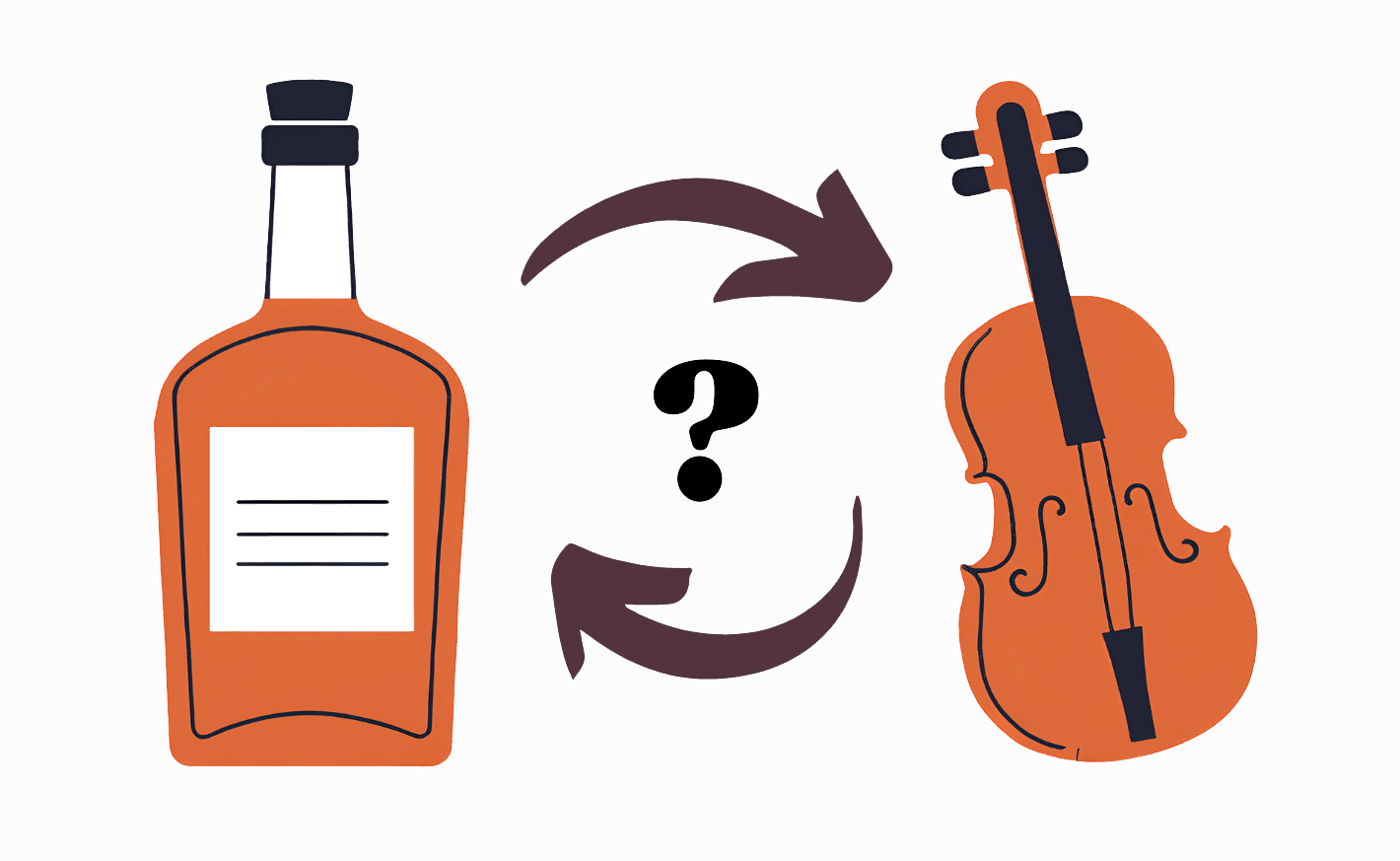
Branding was one of the most debated parts of the project.
Some members wanted to lean into the band’s whiskey-themed identity, while others wanted a cleaner look rooted in musical tradition.
I presented moodboards, facilitated feedback, and guided alignment through multiple logo iterations.
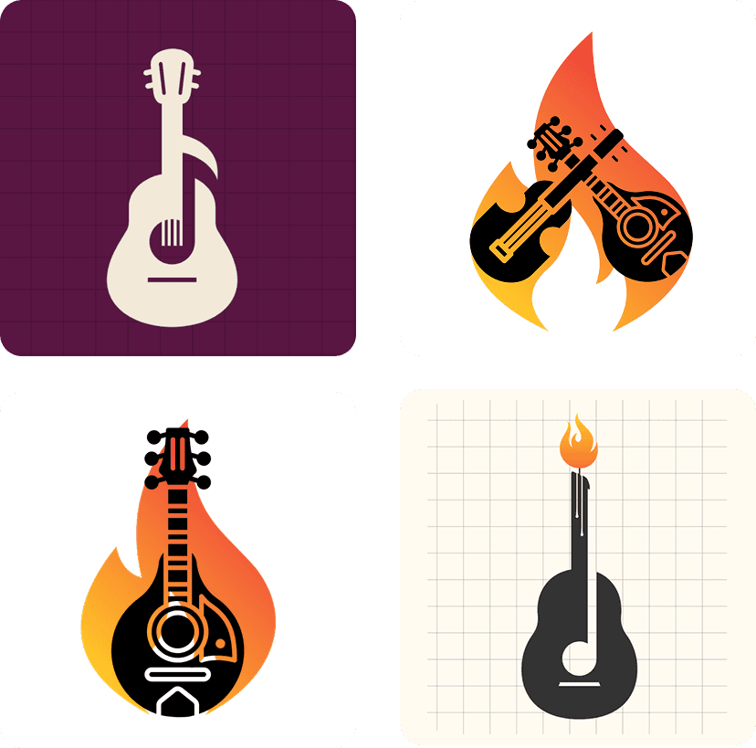
Mood & Direction
I started by creating mood boards, each reflecting different visual directions—ranging from rustic and vintage to clean and modern.
“Whiskey-Inspired”
“Traditional Americana”
"String Band or Bluegrass Imagery”
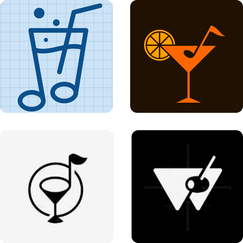
Logo Concepts
V1: Whiskey-heavy concept
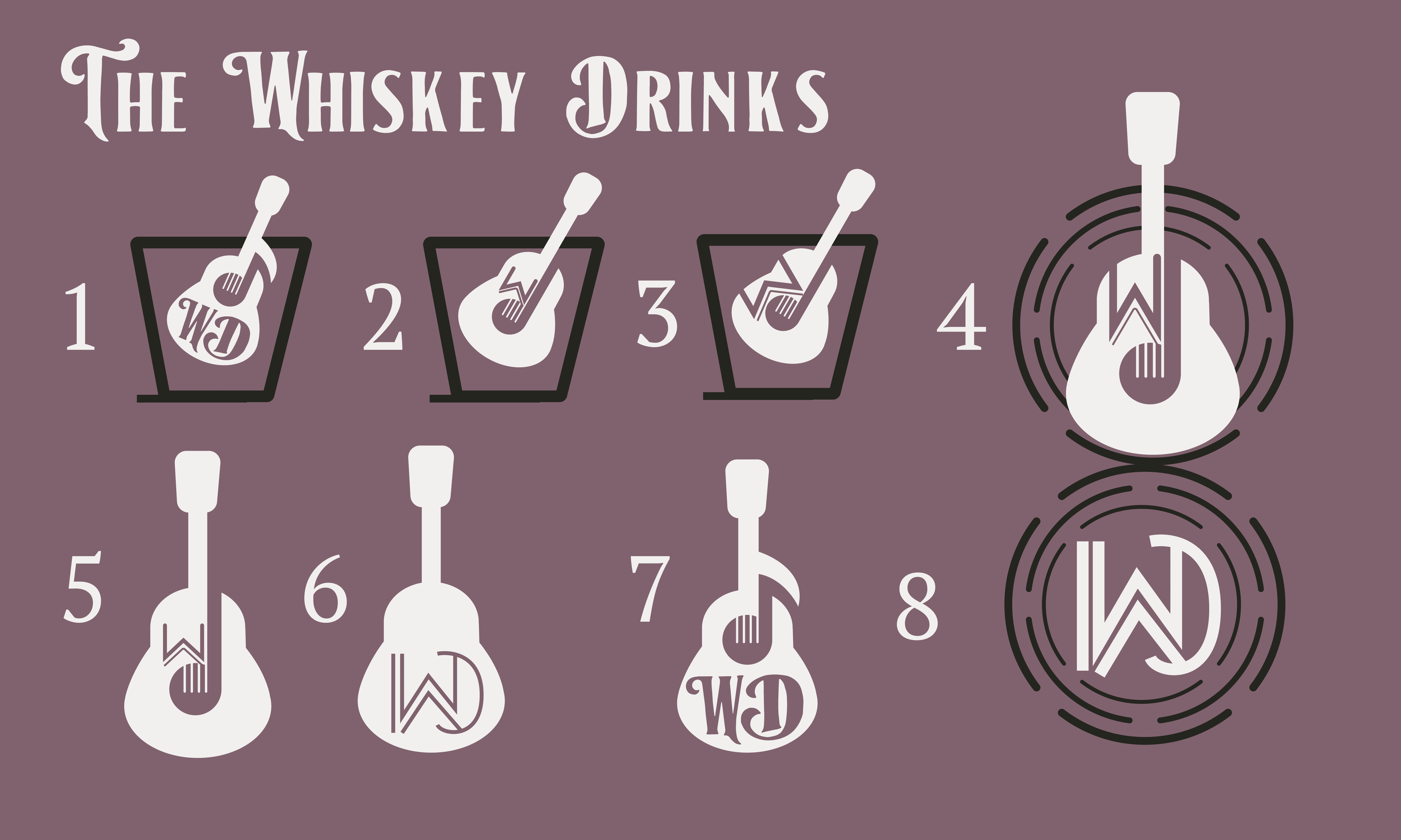
V2: Instrument/symbol blend
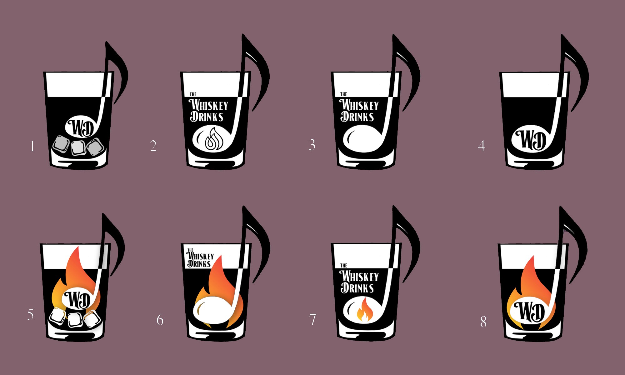
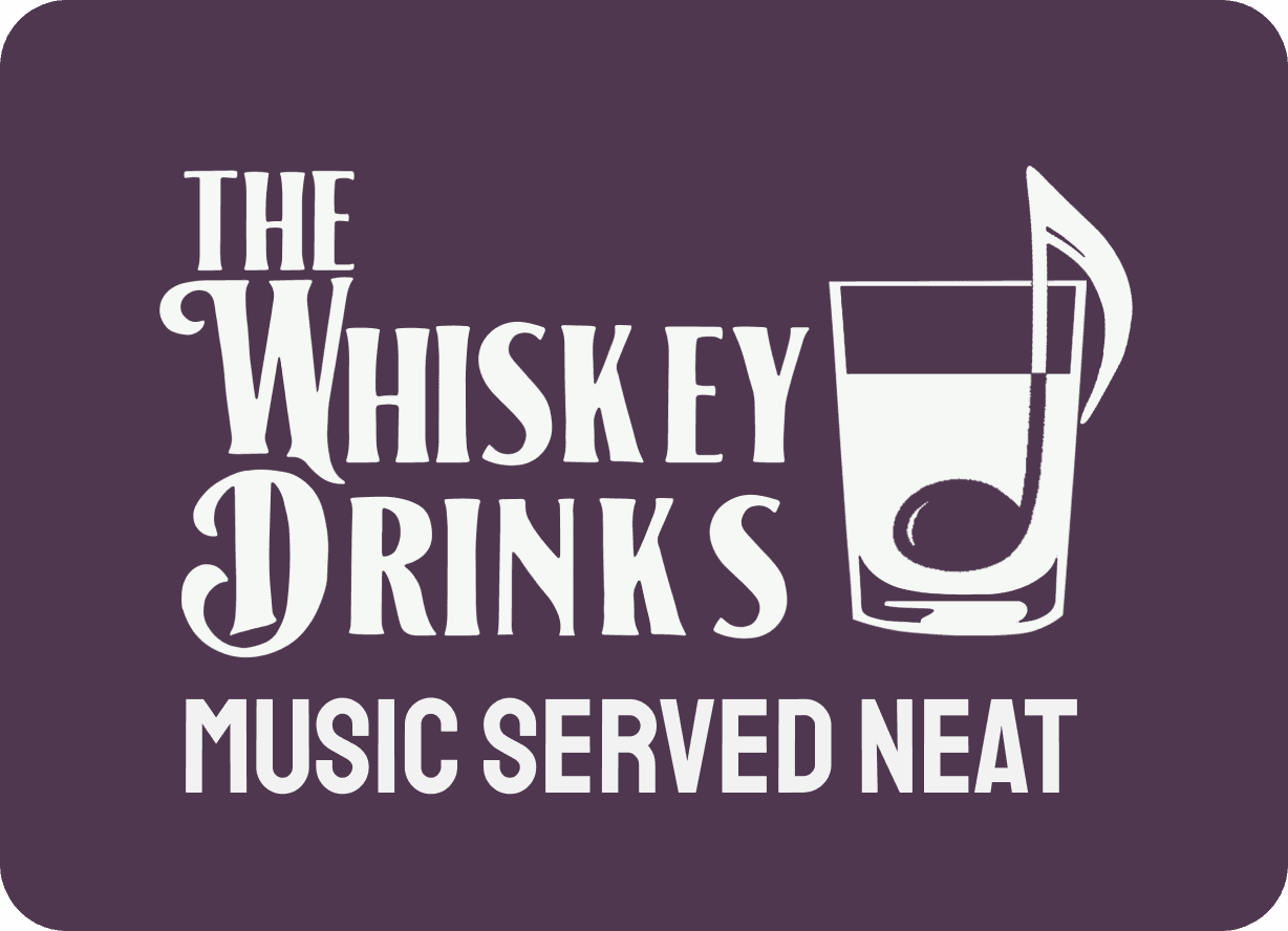
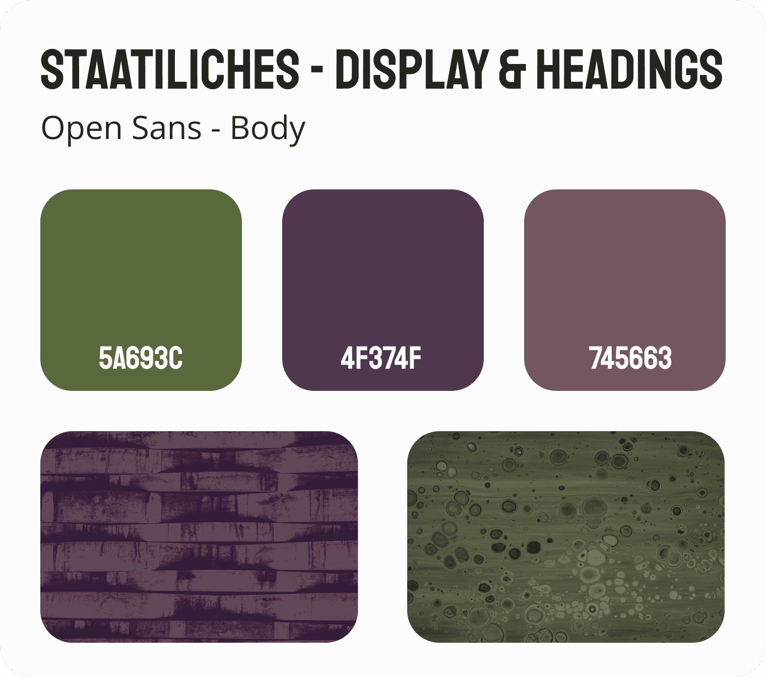
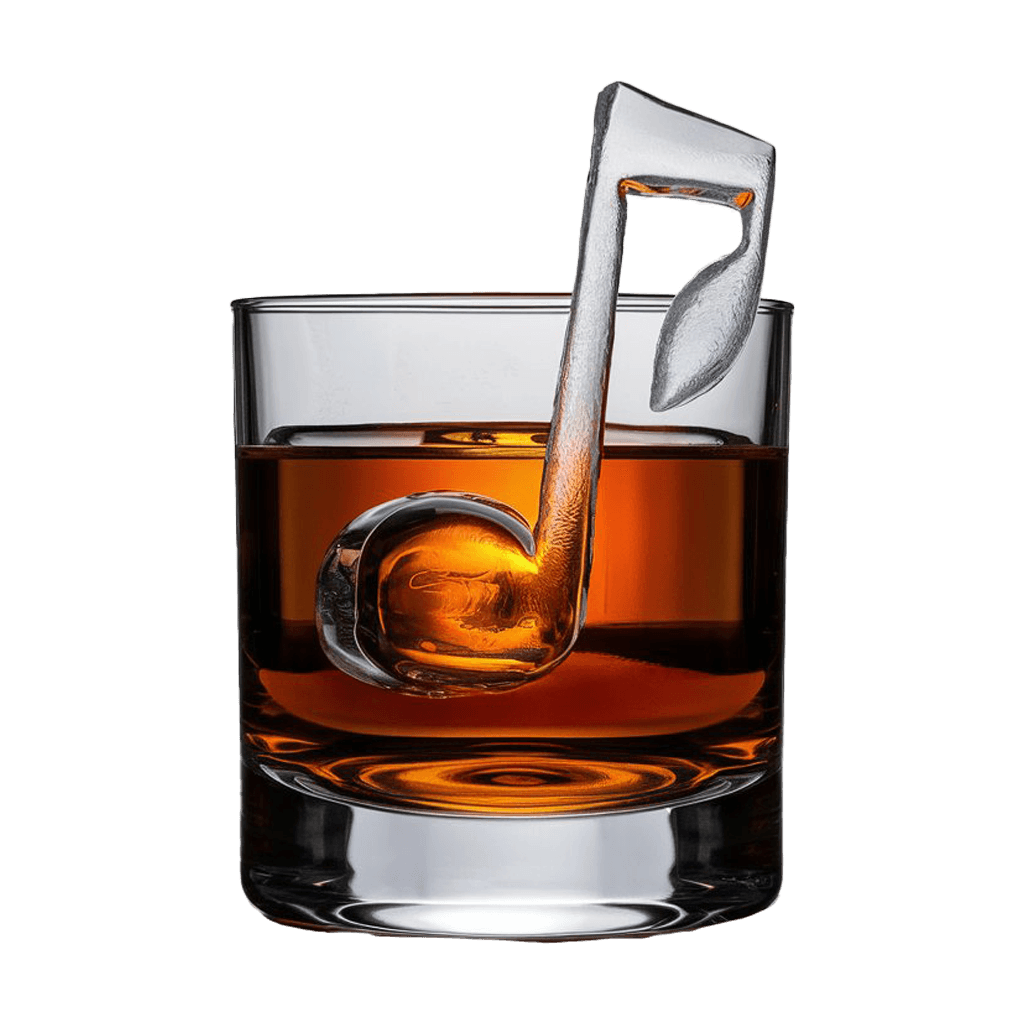
Final Brand System
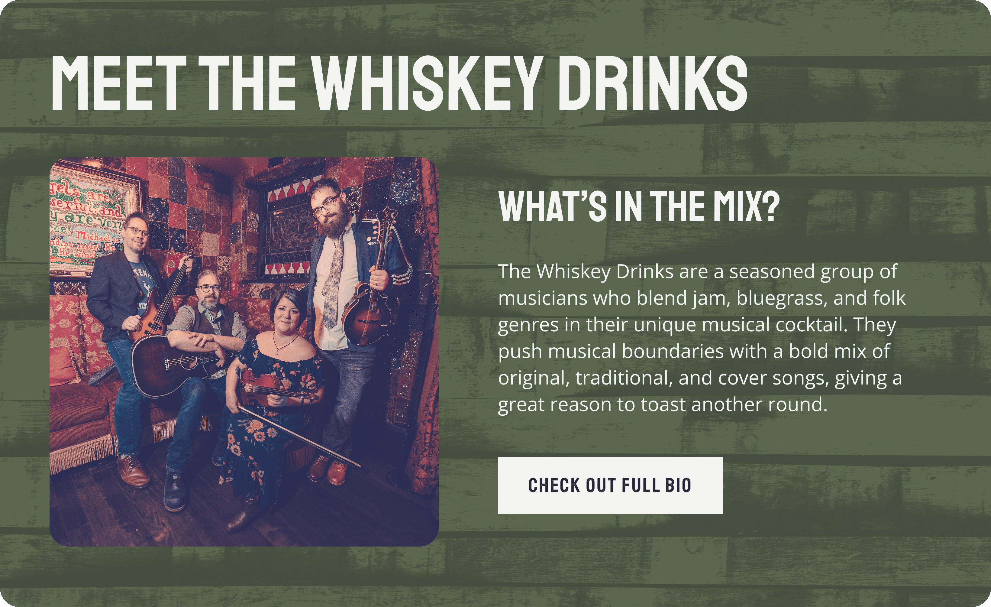
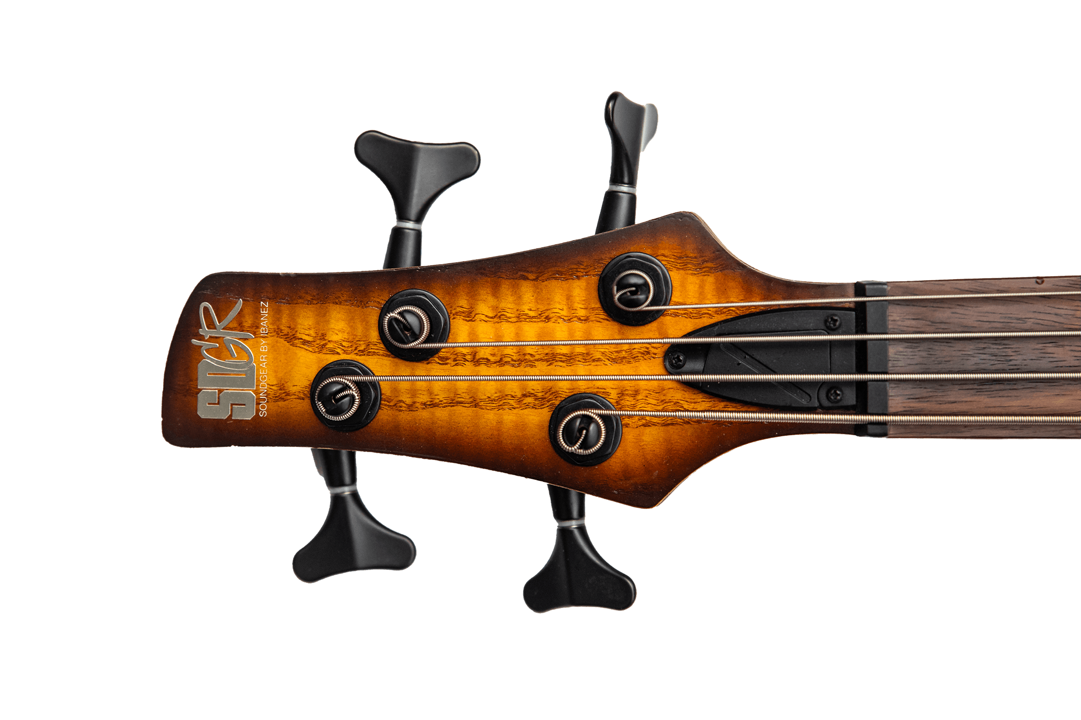
In the end, we created a brand that everyone felt proud of. The final logo, a whiskey glass subtly incorporating a music note, perfectly reflected both the band's name and sound. The color palette—rustic greens and purples—blended their traditional roots with a modern touch, much like their music.
Bringing the Brand to Life
Incorporating photos of the band’s actual instruments helped resolve internal branding disagreements. It grounded the final look in something everyone felt connected to — both on the website and in promotional materials.
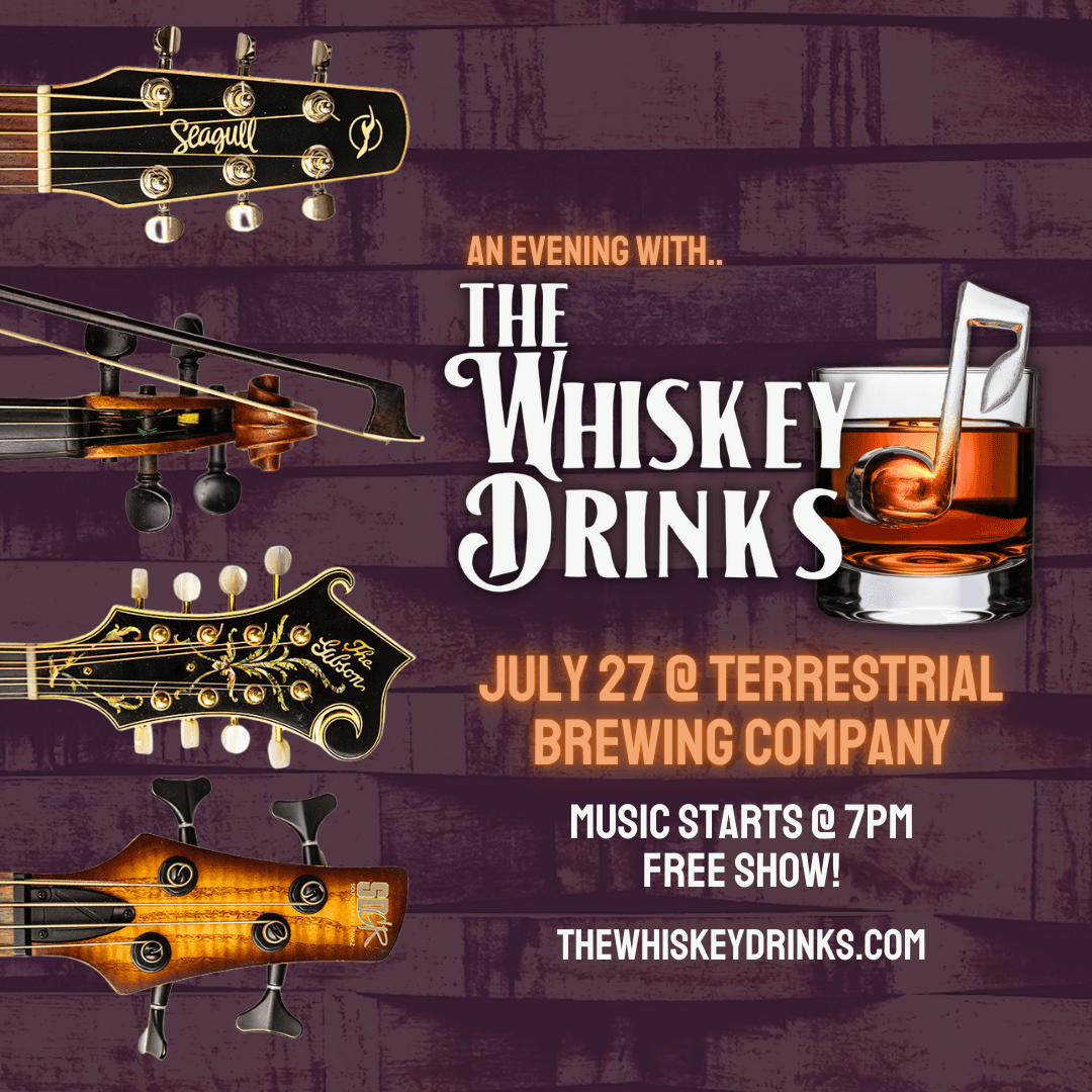
Promotional poster for the band’s first live show using the new brand identity.
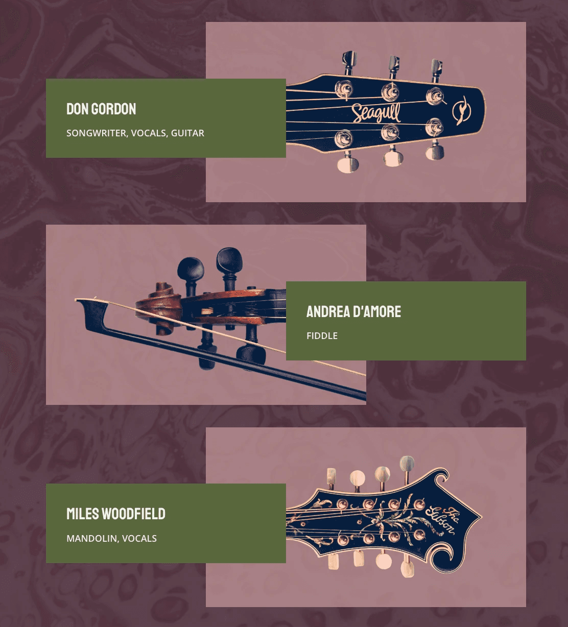
Screenshot from the website’s About page, featuring band member instruments and titles.
We created a brand the whole band felt proud of. The final logo — a whiskey glass subtly shaped like a music note — captured both their name and sound. Rustic greens and purples blended their traditional roots with a modern edge, much like their music.
This identity carried across their site, merch, and social media — resolving early conflicts and presenting a unified brand that resonated with fans and industry alike.
Designing the Experience
Knowing I’d be customizing a prebuilt template rather than designing from scratch, I focused on user flow, content hierarchy, and navigation to ensure the site felt intuitive and engaging for both fans and industry professionals.
Planning the Site Structure & User Flow
I used low-fidelity wireframes to plan out page structure, content placement, and navigation priorities.
This with the iterative process of organizing key features such as:
Event calendar
Online merch store
Music/media integration
An Electronic Press Kit (EPK) for booking agents
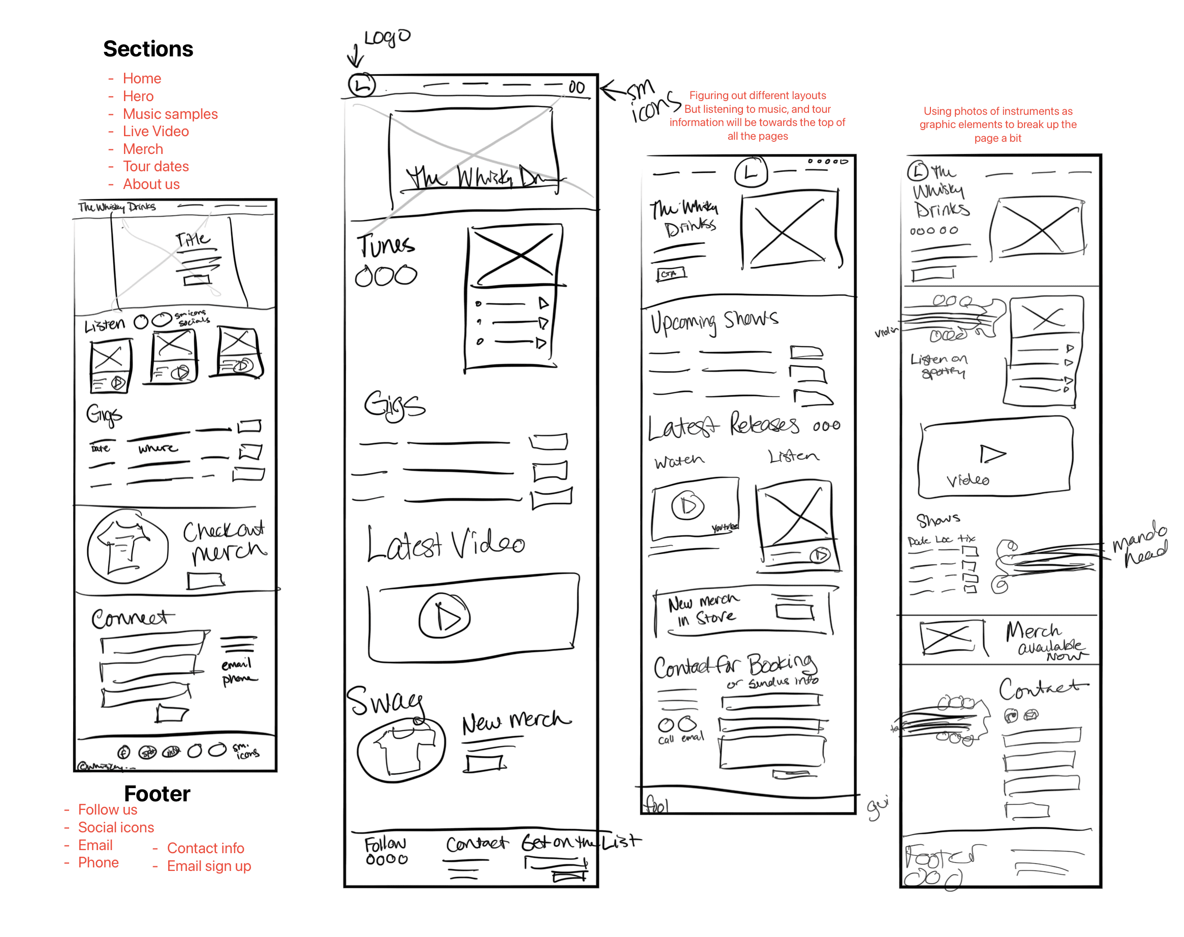
Early wireframes mapping out page hierarchy, key content areas, and user priorities.
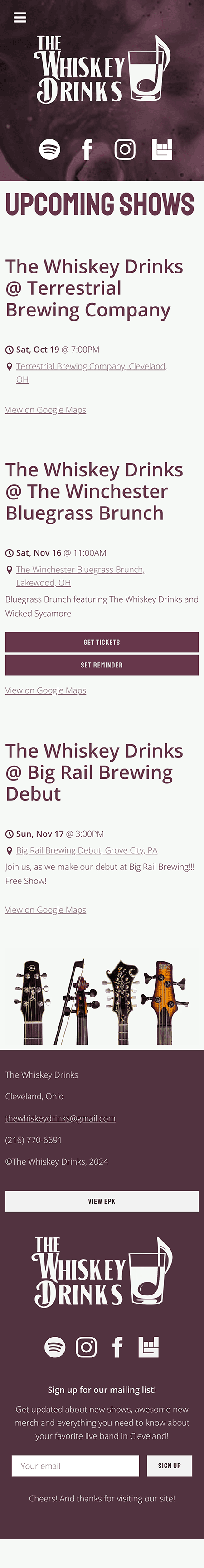
Bringing the Site to Life
Homepage Content & Video
Intro section with band bio and CTA designed to connect quickly with new visitors.
I wrote all site copy in the band’s voice and developed a short homepage video to engage visitors quickly.
The goal was to make the band feel approachable, bold, and bookable.
Rather than starting the site with static images, the video immediately engages visitors and sets a lively tone, getting people excited from the moment they land on the page.
It truly helped capture the spirit of The Whiskey Drinks and made the homepage feel dynamic and inviting.
I love it... holy shit... it's like we're a real band!
Merchandise Design
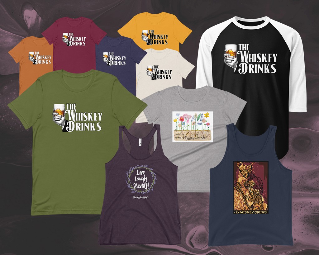
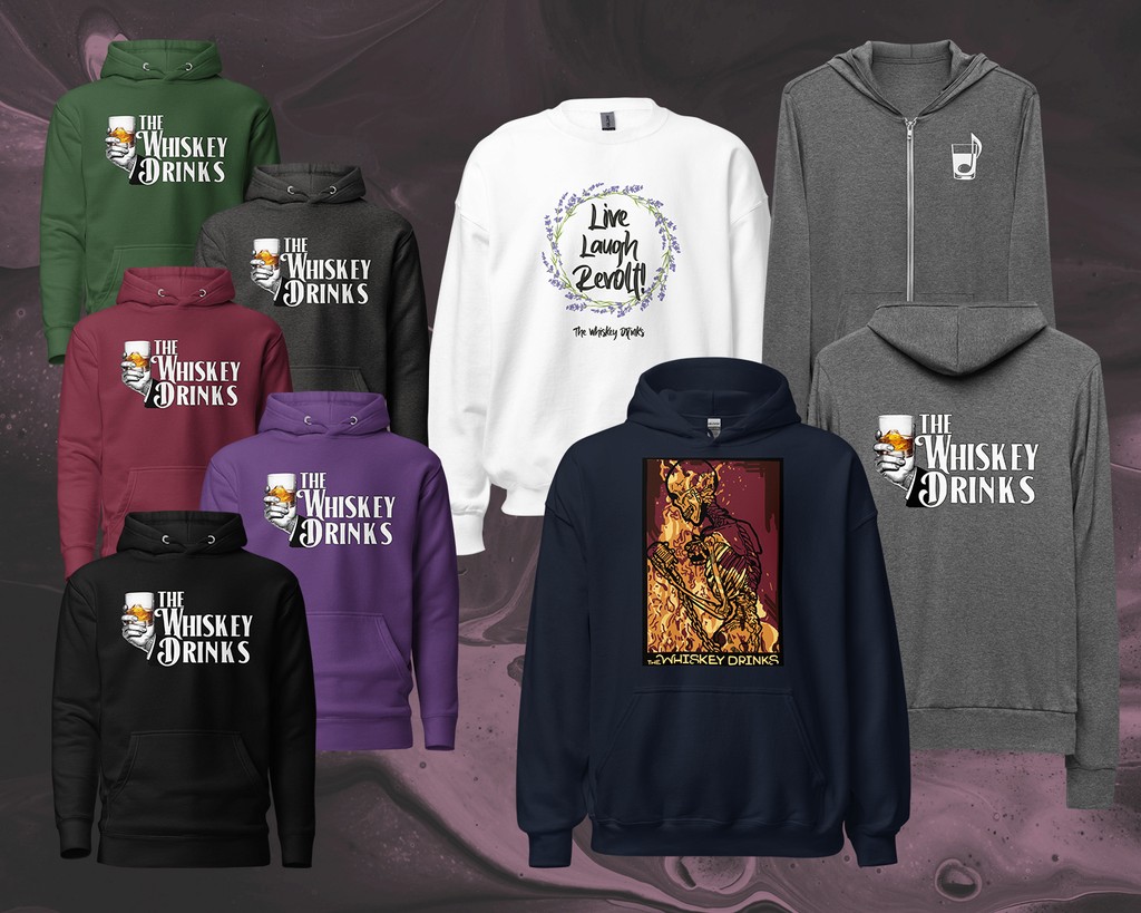
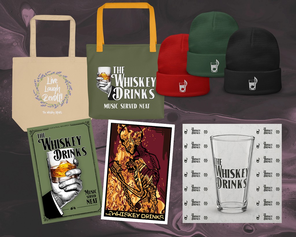
Full branded merch collection
I designed a fully branded merch store using Printful, featuring the new logo on apparel and other fan-designed items.
The goal was to create a seamless, on-brand experience that felt like an extension of the band’s personality — not just a checkout page.
Highlights:
Offered over a dozen customizable items — from tees to posters
Designed store layout and product visuals to match the site’s look and feel
Added QR codes at live shows for easy mobile checkout, with no inventory hassles
The result was a merch shop that fans loved and the band could easily manage — with no overhead and full brand alignment.
From Setup to Scale: Building a Flexible Site They Could Own
I implemented the final site using a no-code platform, customizing its layout, structure, and content to match the brand’s identity and user goals.
My priority was usability — both for visitors and for the band — so the experience would be smooth to navigate and easy to maintain without a designer on call.
Key Contributions:
Customized layout & navigation to highlight high-priority actions (tour dates, merch, EPK).
Adjusted content flow for mobile users and fast scannability.
Wrote & organized all UX copy, guiding users clearly through the site.
Trained the band on edits, ensuring they could update content themselves post-launch.
The final site felt personal, easy to use, and sustainable for a small team — no code required.
With the scheduled launch day rapidly approaching, we had to move through testing faster than usual. Despite the tight timeline, this step proved crucial in refining the website and ensuring it delivered the best user experience possible.
Usability Testing with Key Users
Booking Agents
Booking agents focused on the usability of the EPK & how easily they could access key information.
The Fans
Fans tested the ease of navigating event listings, purchasing merch, & interacting with streaming content.
Quality Assurance Expertise
In addition to user feedback, we brought in a software quality assurance project manager for a thorough review.
Their findings included:
Small issues with Spotify, Amazon, and Bandsintown links not working on certain icons.
The Gmail link on the homepage incorrectly redirected back to the homepage.
Minor quirks with the Printful shop, such as issues with shipping and tax calculations.
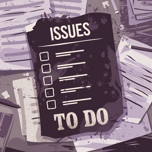
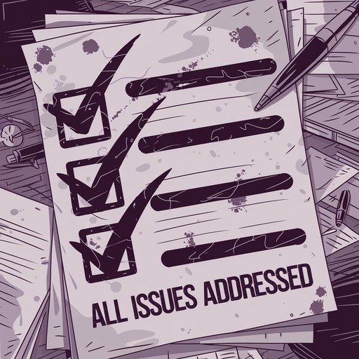
Priority Revisions
After incorporating feedback from both user testing and the QA review, we made final tweaks to ensure the site was functioning smoothly. Despite the tight schedule, all of the issues discovered were quickly addressed.
This feedback highlighted minor but crucial adjustments. Fixing these areas was essential to provide a seamless experience for fans and ensure that booking professionals could quickly access relevant information.
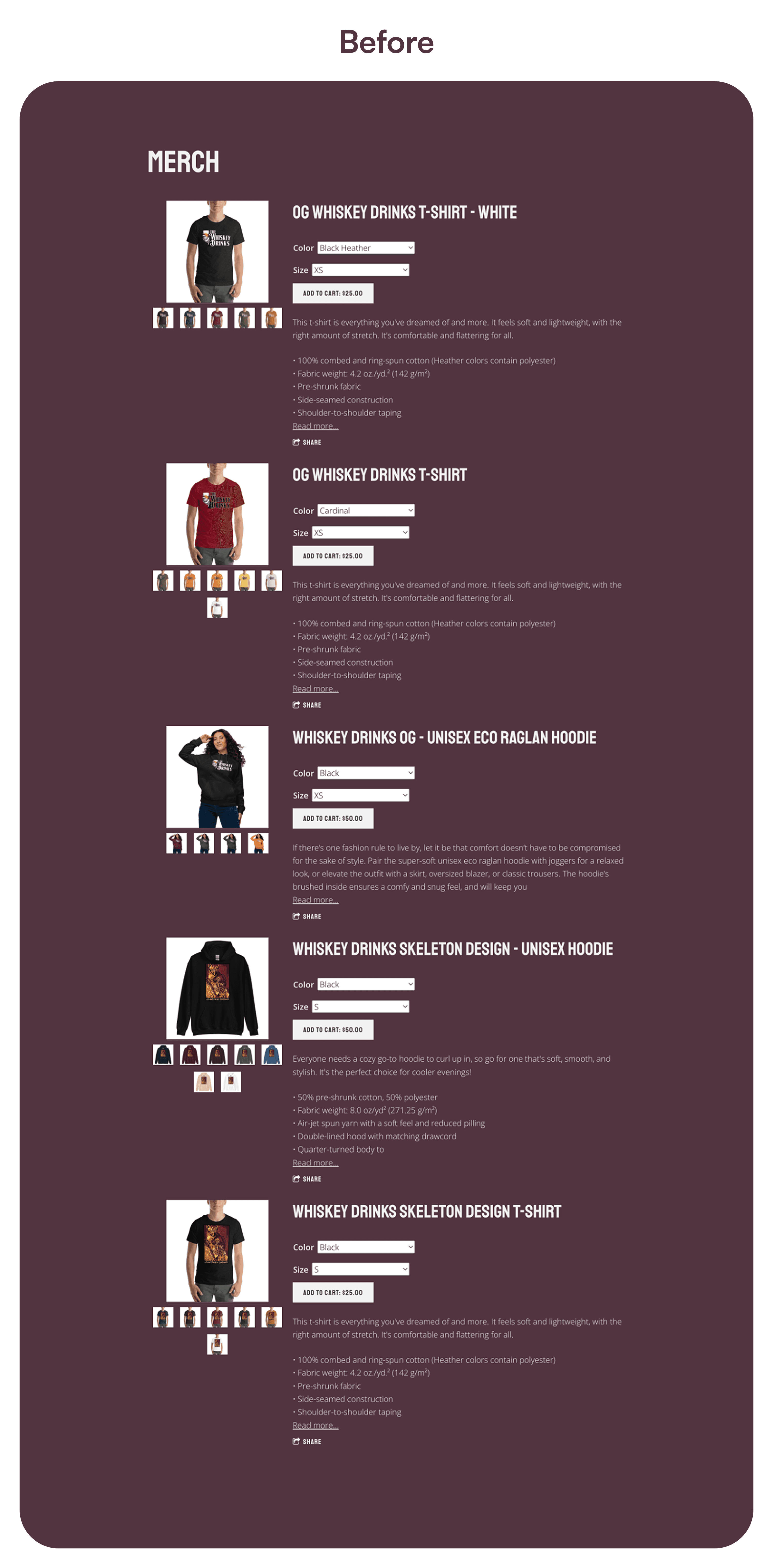
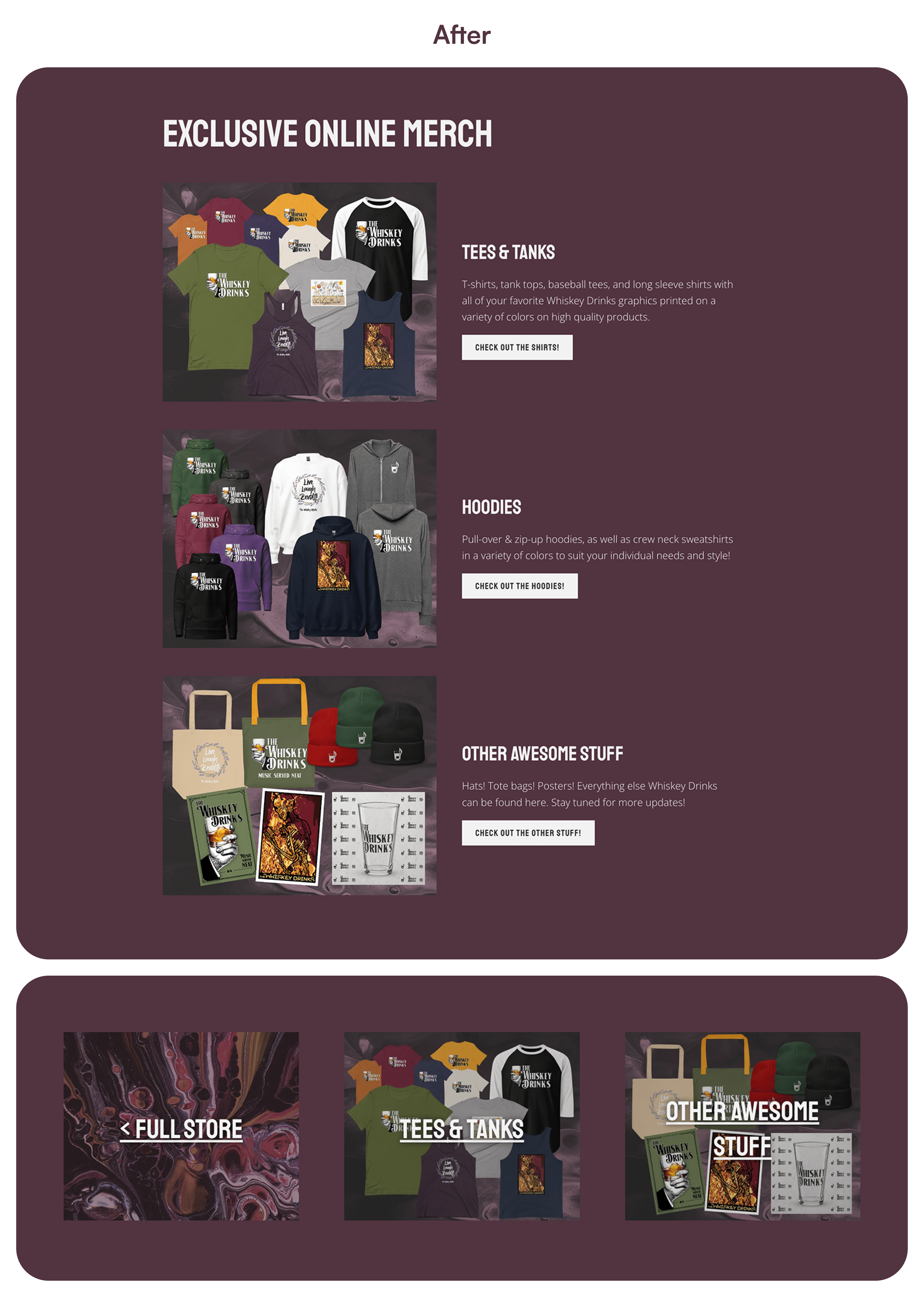
Merch Page Redesign: Creating a More Engaging and Organized Experience
The original merchandise page presented all products in one long, unorganized list, making it difficult for users to find what they were looking for and creating a disengaging shopping experience.
To fix this, I reorganized the merchandise into clear categories: Tees & Tanks, Hoodies, and Other Awesome Stuff. Each category page featured easy navigation links to the other sections, ensuring users could easily browse through different product types without feeling overwhelmed.
This improved layout made the experience more streamlined & enjoyable for fans, while boosting the visibility of the full range of products.
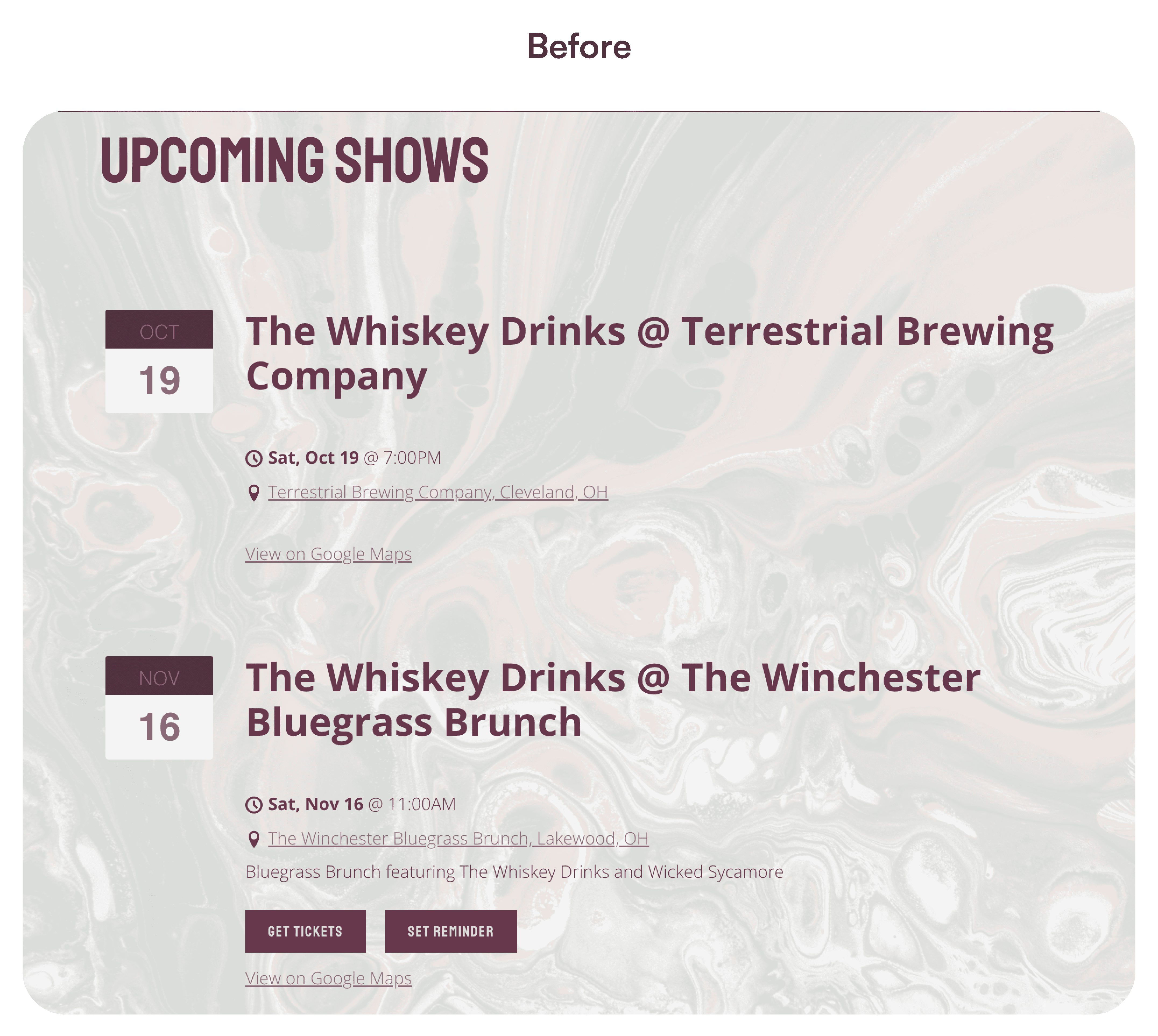
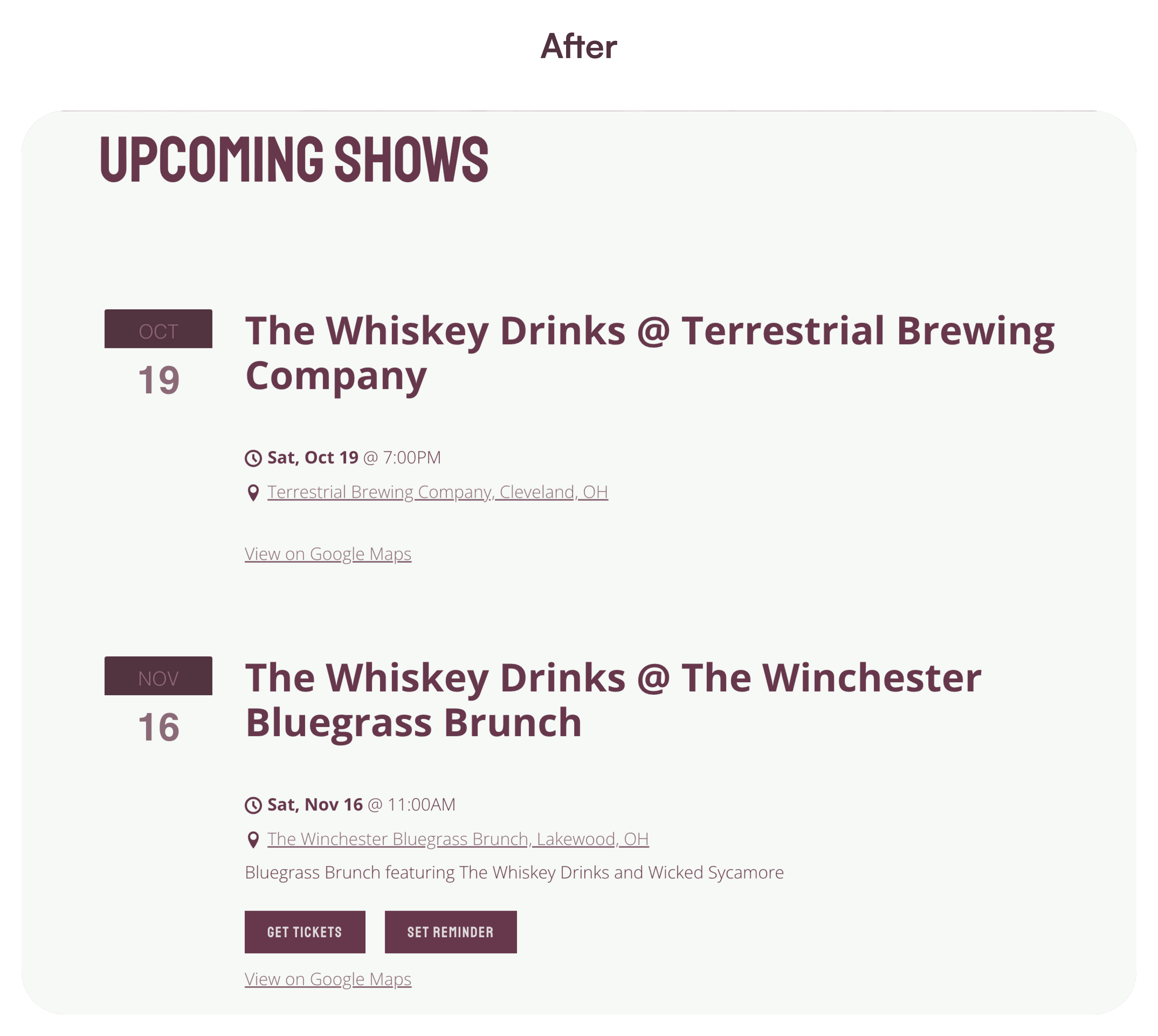
Event Listings: Enhancing Clarity and Accessibility
The original event listings section used a background that was too visually distracting, making it difficult for users to easily view upcoming shows. Given that this is one of the most important sections for fans, it was essential to improve its visibility.
To address this, I opted for a clean & bright backgrounds prioritizing readability and accessibility. While the page used abstract textures elsewhere for visual interest, the event listings needed to stand out clearly. By simplifying the design, I ensured that fans could quickly and easily find the band’s upcoming shows without distraction.


The results were immediate:
100 visitors on launch day & over 600 in the first month
A 30% bounce rate, showing strong engagement
Over $150 in merch sales in the first week alone
National exposure, including several out-of-state bookings & participation in multiple showcases at the 2024 IMBA's World of Bluegrass Festival
We’re blown away by the new site. It’s not just beautiful, it’s functional—and we’ve already seen the benefits in terms of more gigs and more fans buying our merch online. It’s everything we wanted and more.
I was on an IBMA conference call, and they had such great things to say about the website! Said it was exactly what venues would look for and had everything they would want in a website!
Final Note: Turning Passion into Purpose
This project was an absolute dream come true. It gave me the chance to blend my past experience as a photographer & content creator with my newfound passion for UX design. It wasn’t just about creating a fancy website—it was about building something with real purpose.
From the very beginning, I made sure that everything I designed came from user research & data, focusing on what The Whiskey Drinks & their audience truly needed. It was exciting to craft a digital platform that not only looked great but functioned seamlessly for both fans and industry professionals.
Challenges & Results
The biggest challenge was managing client collaboration in my new role as a UX designer. While I’ve worked with clients as a professional photographer for over 15 years, balancing different opinions and keeping the project on track was a new experience.
It pushed me to refine my communication skills and adapt my freelance expertise to UX. In the end, the collaboration paid off, resulting in a brand and website that the band and their audience love. Fans & industry pros have praised the site—some saying it’s better than websites of bigger bands they've seen.
This feedback has already led to new clients within the local music community, which feels like a huge win as I transition into UX design. Hearing such high praise confirms that this project hit the mark, and I couldn't be more proud.
Lessons Learned
This experience taught me that UX is about much more than design—it’s about listening, collaboration, and creating real solutions. It also reinforced that my background in photography and content creation is an invaluable asset to my design process.
Each project is a blend of creativity and strategy, and that’s exactly what I loved about this work.