CASE STUDY
Going on tour with friends, whether for a single show in another city or embarking on a road trip for multiple concerts, is an exhilarating experience. However, the preparation and planning involved can often be overwhelming.
Coordinating logistics, booking accommodations, purchasing tickets, and managing individual preferences for group trips to music events can be daunting. These tasks often involve complex planning. Disorganized communication, fragmented information across multiple platforms, can make it difficult for users to manage their trips effectively.
This project aimed to address the complexities of group travel planning, focusing on improving communication and sharing of everyone's ideas. My goal was to develop an app that organizes all of this information, making the planning process more enjoyable and efficient.
TripMates is an end-to-end app designed to streamline group travel planning with a collaborative itinerary planner and real-time communication tools.
This app simplifies group coordination by enabling users to share and discuss activity options on the go, reducing planning stress while allowing for spontaneous, fun experiences.
Ultimately, it streamlines travel planning, making live music trips more enjoyable and memorable for everyone.
Exploring the Design Process
DISCOVER
DEFINE

Much like planning a road trip with an itinerary, I began this process with a focused research plan. It served as my North Star, guiding me through the rest of the journey.
Research Objectives
Understand current trip planning and communication methods in order to try and streamline these processes.
Identify features of commonly used travel planning apps to inform our app's design.
Explore how people share activity ideas during trips to enhance collaborative planning.
User Objectives
Simplify trip planning and communication for a better user experience.
Enable easy sharing and organization of activity ideas to enhance trip enjoyment.
Business Objectives
Differentiate TripMates from other travel planning apps by focusing on group trips for music events.
Boost user engagement and satisfaction to drive app adoption and retention.
A good place to start is simply looking at what is already being used
I reviewed online articles and travel blogs to identify commonly used travel planning apps across various categories, including domestic, international, business, and general group trips.
Key findings included:
Observations made of diverse approaches to planning, tracking, and communication.
The most feature-rich app had a high cost ($50+/year per user) making it less accessible for group use.
User reviews found in the Google Play Store provided a broad range of feedback without having actual users of each platform available to me
Screenshots taken from each app provided valuable insights into currently used design patterns. This perspective helped me create a consistent and user-friendly user interface. Analyzing these app’s design systems informed the architecture of essential features for the MVP.
Methodology
Conducted seven interviews via Zoom or in person.
Included individuals with diverse personal preferences and financial backgrounds.
Focused on those who typically serve as the "point person" or prefer to lead trip planning.
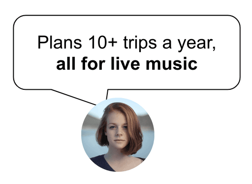
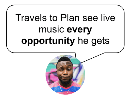
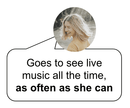
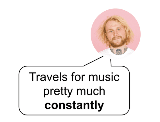
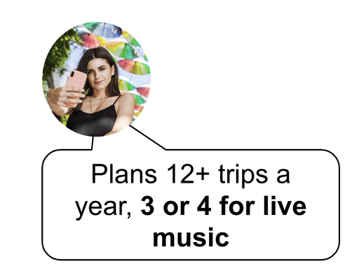
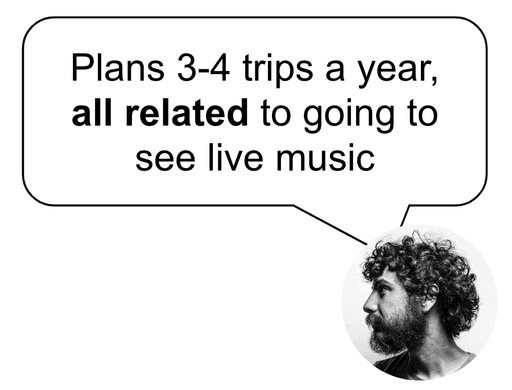
Participants frequently travel with groups to see live music multiple times a year.
Just how often do these people travel for live music?
Key Takeaways
Opportunity 👉 Create a single, consolidated platform that can try to do the following:
Allow friends to share ideas & explore options
Categorize ideas by subject
Create a voting/polling feature
Make content scannable, searchable & easy to find
Impact on Project: These insights directed the design towards creating a unified, user-friendly platform to simplify the process for better trip planning efficiency.
By creating a journey map, I worked on breaking down the entire process. Documenting the emotional highs and lows, and taking the time to really consider what people were doing in terms of logistical challenges, as well as their thought process about why they are doing it. It helped uncover some potential areas for enhancing the overall experience.
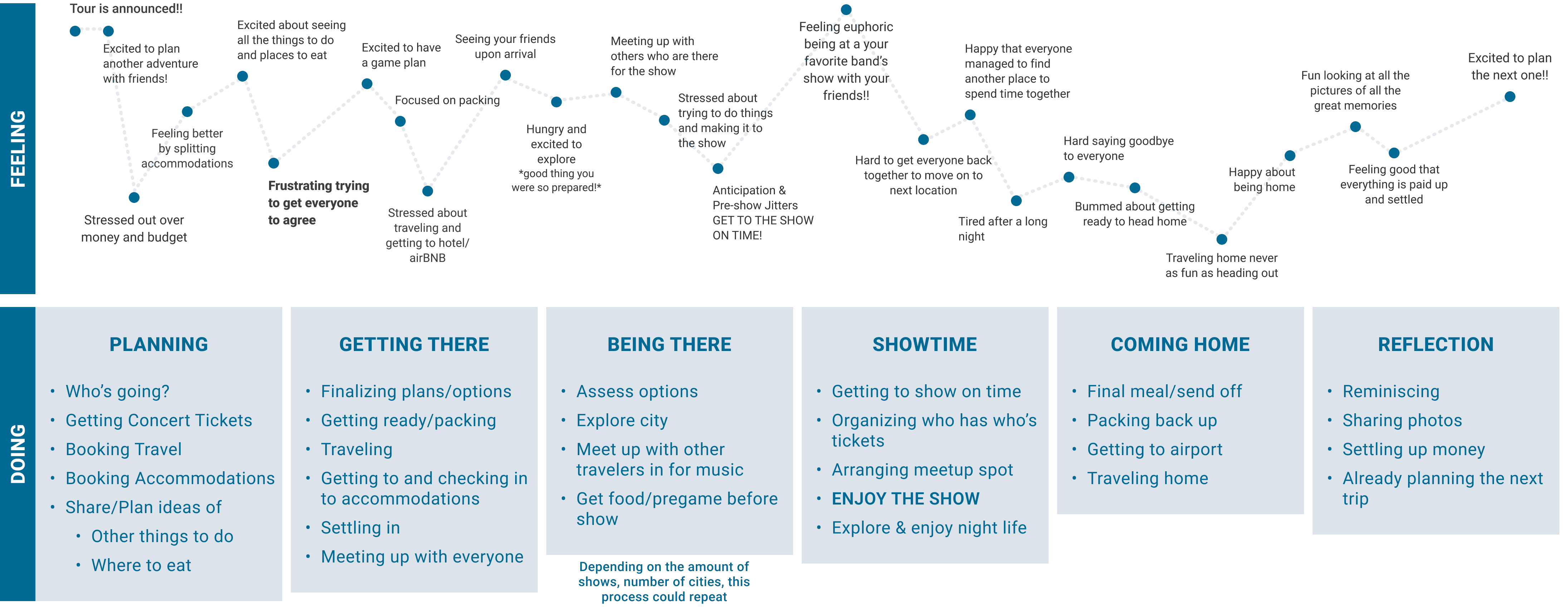
Key Challenges & Potential Solutions
Planning Coordination
Problem: Difficulty in organizing travel plans and concert details.
Solution: A centralized platform for consolidating trip information.
Logistical Stress
Problem: Stress related to packing, traveling, and timely arrivals.
Solution: Real-time alerts for travel times and packing checklists.
Group Communication
Problem: Keeping everyone informed & on the same page.
Solution: A dedicated chat group that helps organize ideas shared with options for feedback.
The numerous insights from the Discovery phase were organized into sections, forming the app's foundation. Developing ideas in a mind map helped break down each section, defining the app's structure.
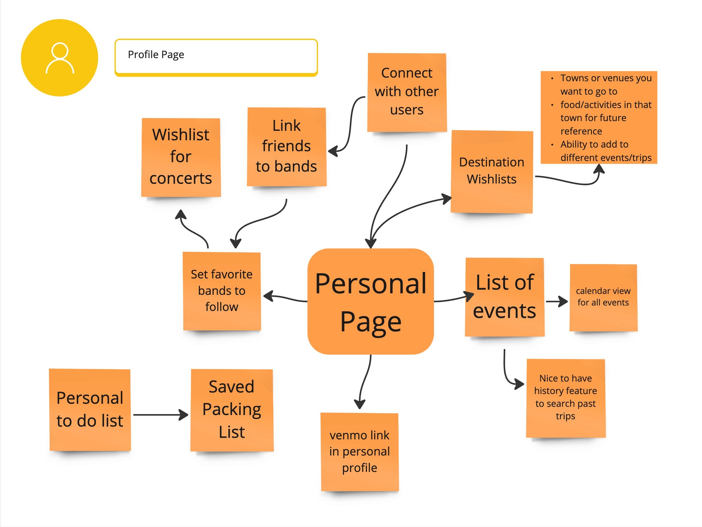
Organizing ideas in Miro helped prioritize features for the MVP. The result was a focus on essential screens needed for testing key functions.
I know there is a lot of information here. If you are interested, here is a link to view all of it in detail..
During this process, the scope of the project expanded significantly. For example, I explored the potential integration of AI/ML elements but decided to reserve those for future enhancements due to their complexity and lack of necessity for the MVP.
To manage and prioritize features, I implemented a Kanban template to categorize ideas and refine them. This iterative approach allowed me to align the design with research objectives and project goals in mind.
While figuring out which feature went in which category, I tried my best to back up each decision based on solid insights from the Discovery Phase.
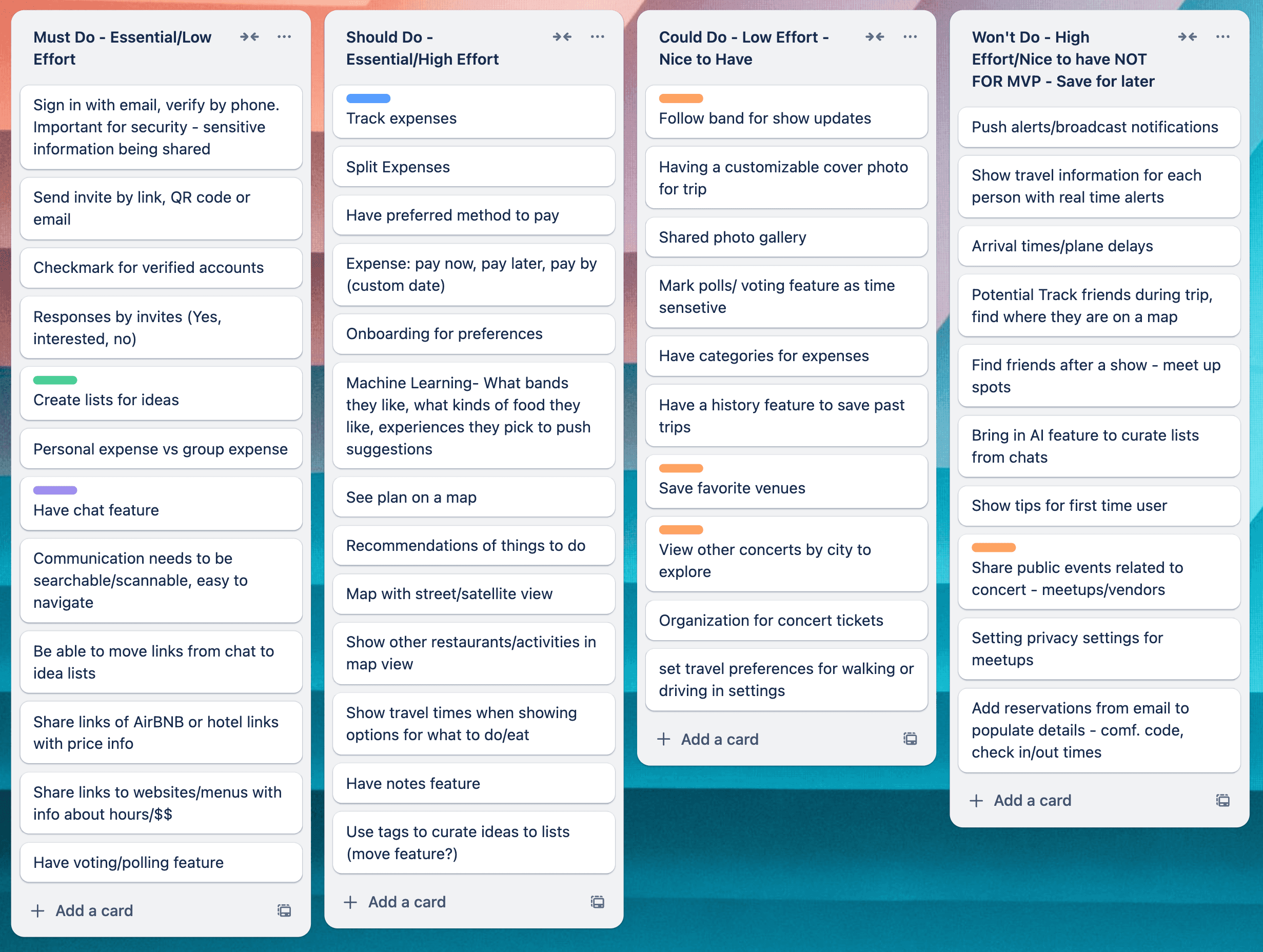
This step was crucial for organizing and speeding up the design process. The focus was now on creating key screens needed for MVP testing, ensuring a user-friendly and efficient app.
For me, every design starts with pen and paper. It's where I can freely explore ideas, jot down notes, and map out functionality. It's my creative sandbox, where nothing’s off-limits. For this project, I filled almost half a notebook, diving deep into ideas and letting the creativity flow without constraints.
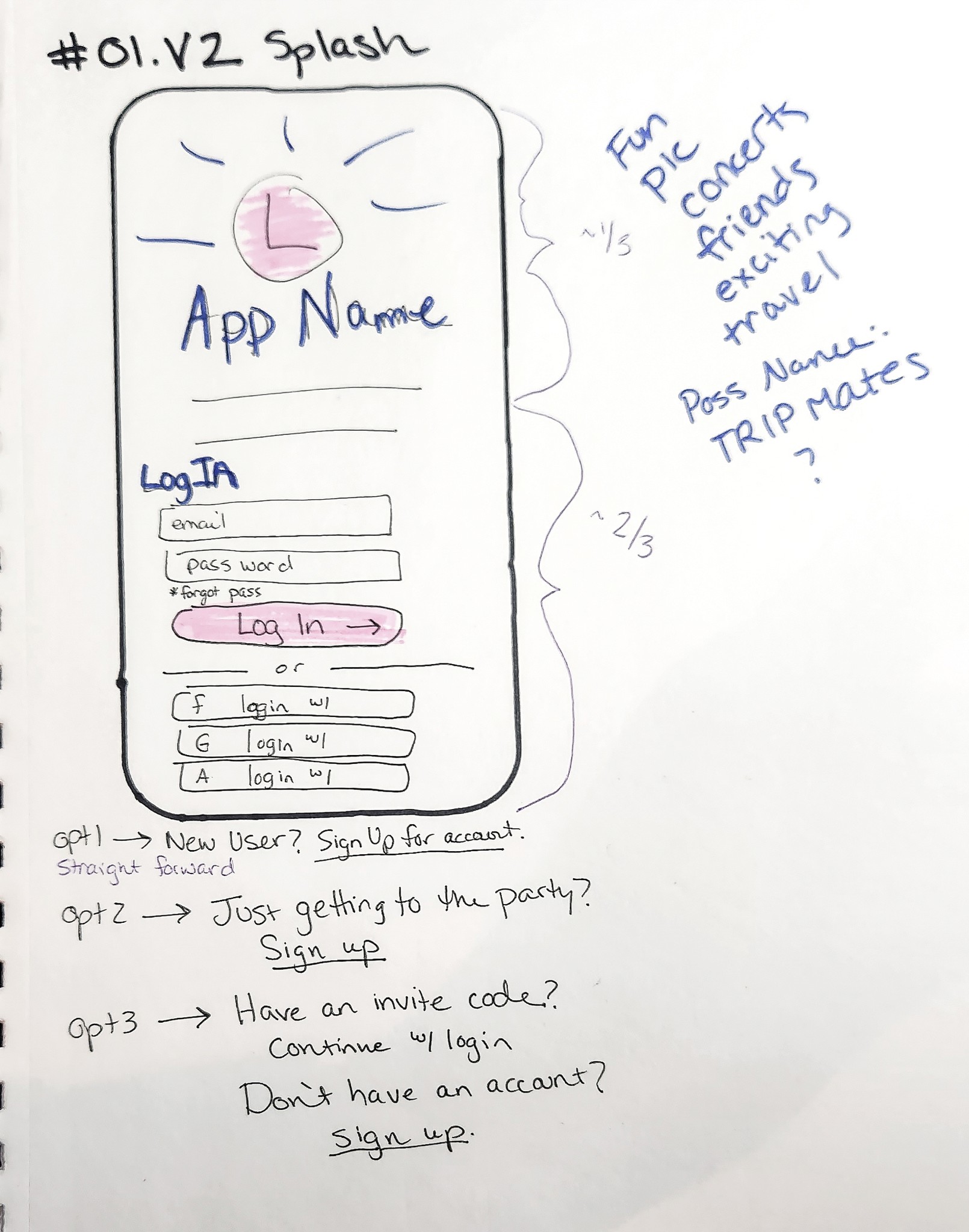
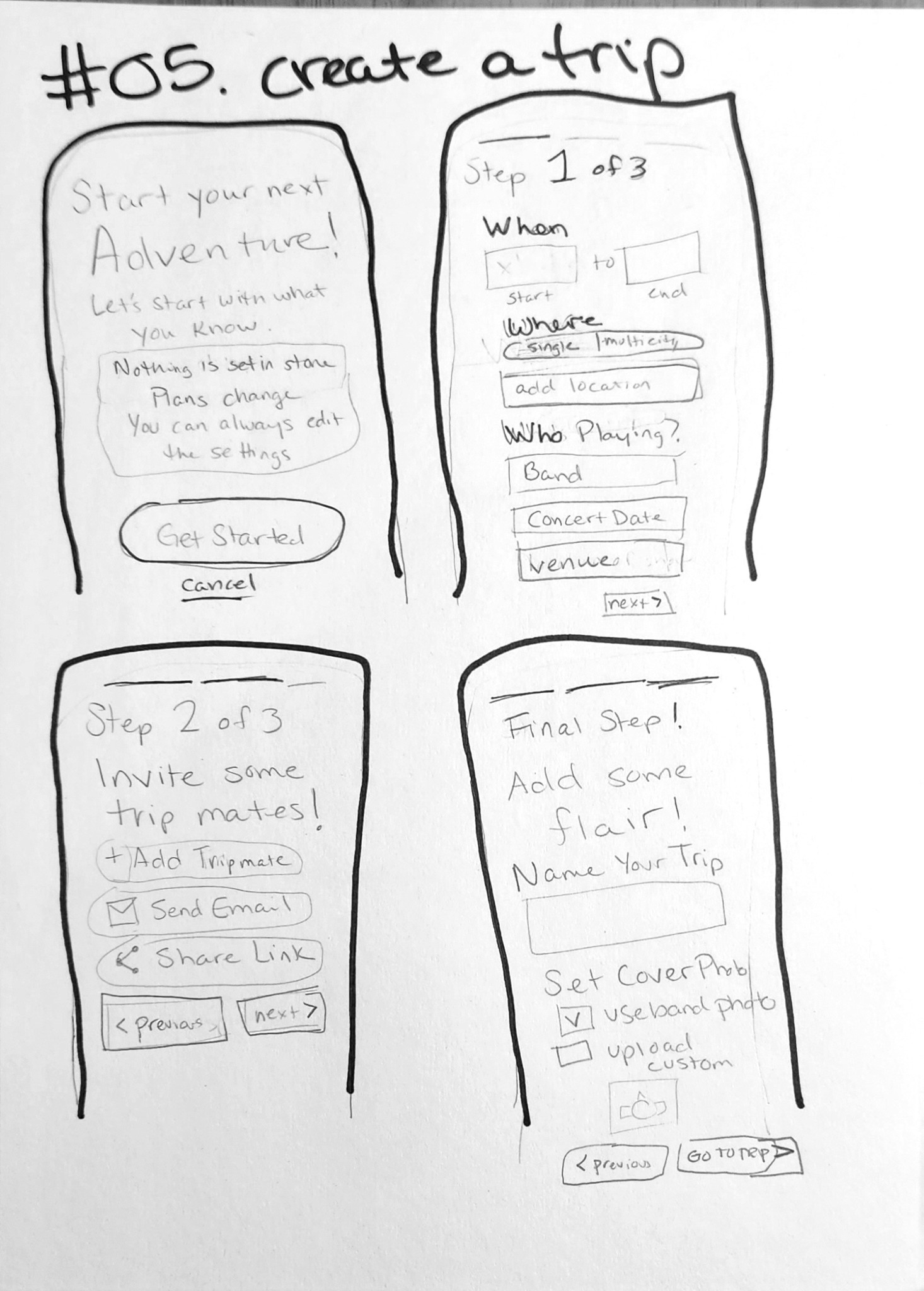
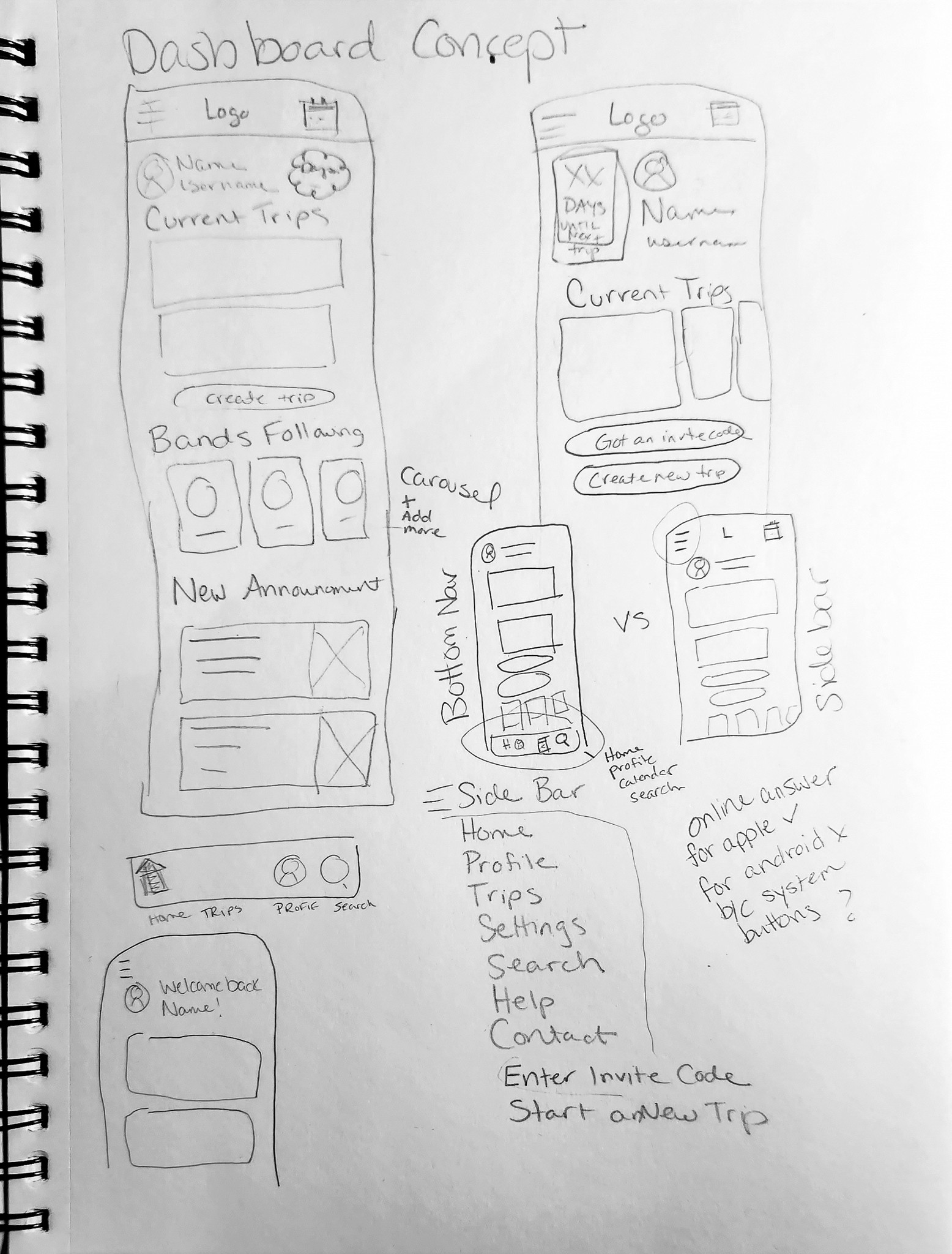
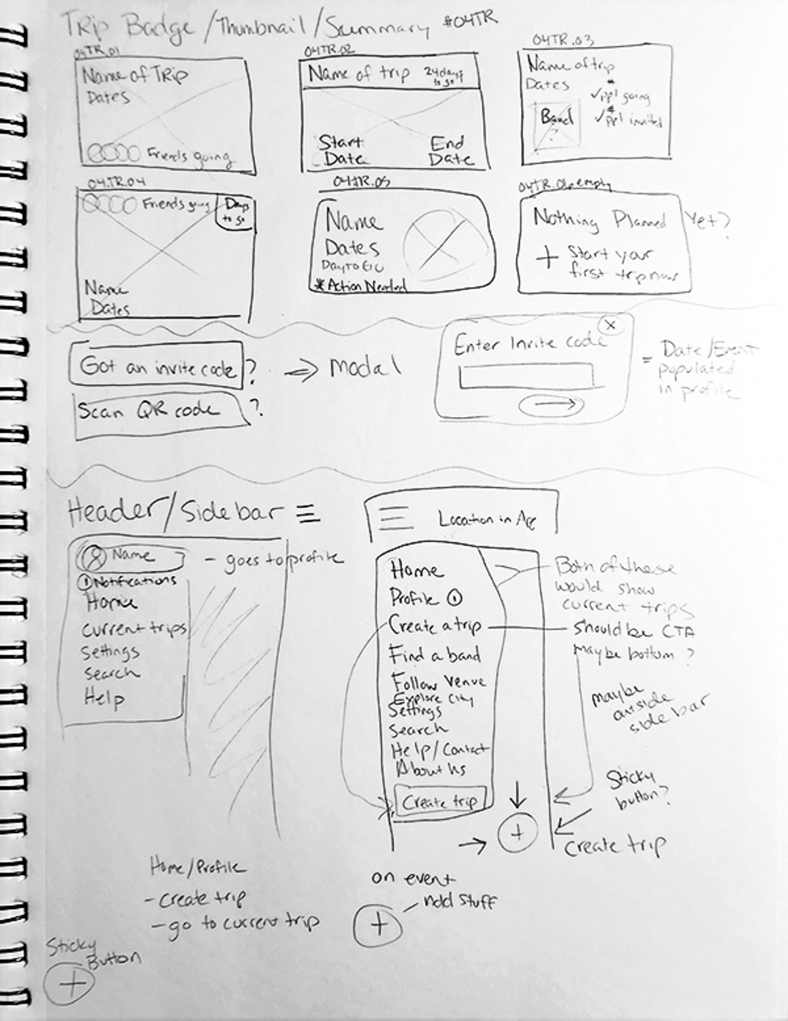
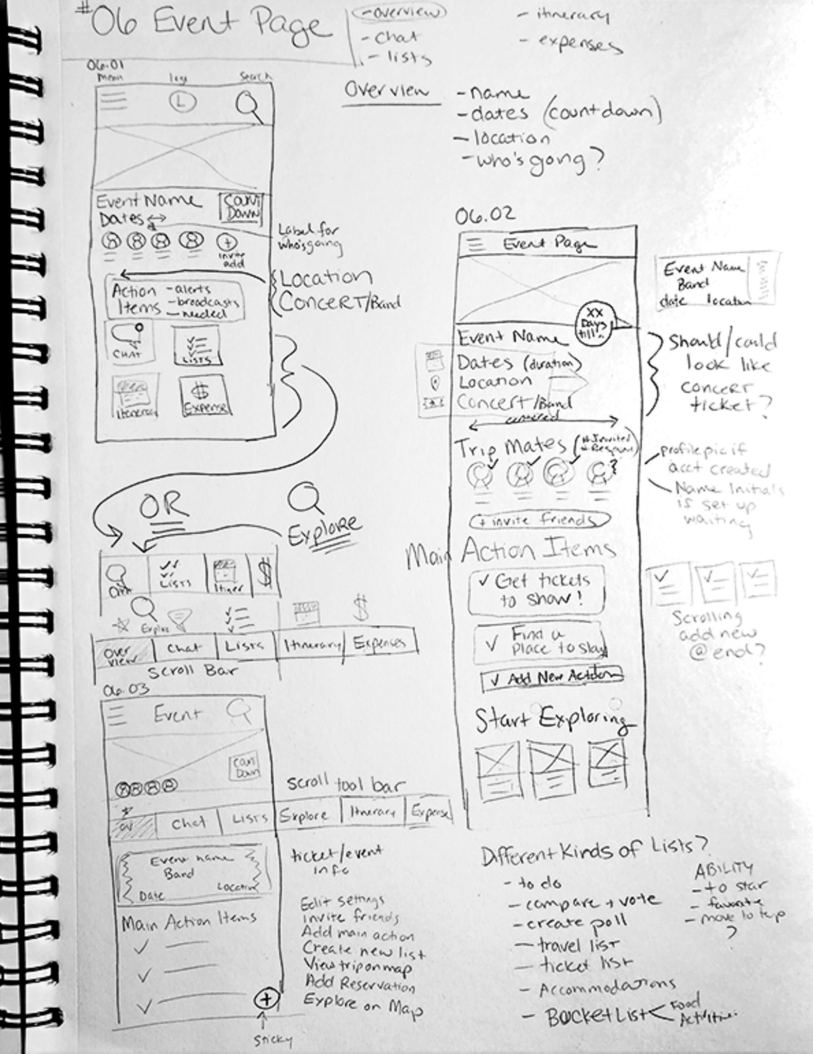
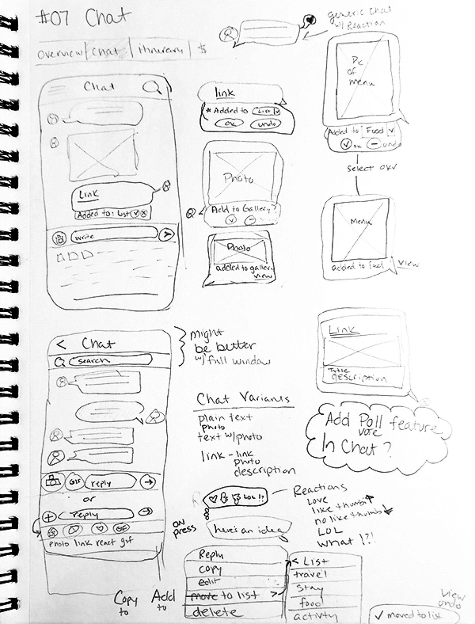
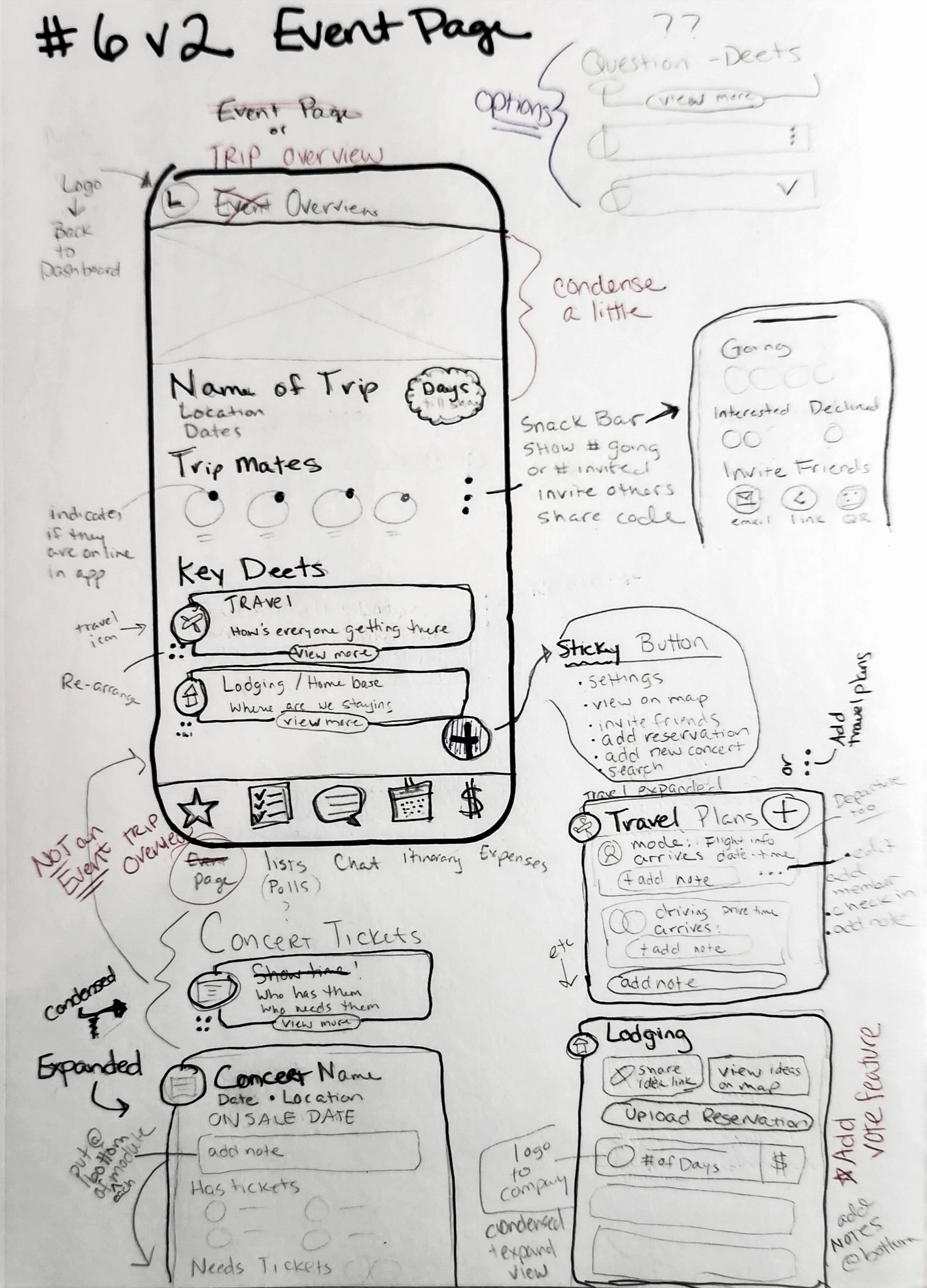
Sketching Process
Created sketches using pencil, ink, and paper.
Visualized the app's screens, components, and menu options.
Explored 1-3 design variations for each screen.
Iteration and Feedback
Generated numerous ideas, leading to a large volume of sketches.
Sought multiple sources of feedback to focus and refine the design.
Prioritized sketches that aligned with the MVP objectives.
Outcome
Focused on the most critical screens for prototyping and testing.
Refined to ensure essential features and functions were well-represented.
Finalized sketches annotated to guide the next stages of development.
To bring the app to life, I created mid-fi wireframes using the Material 3 and Stream Chat design kits. This sped up the process and taught me how to work within existing frameworks & design patterns.
The wireframes focused on onboarding new users and managing trips in progress, with task flows and annotated screens clarifying user interactions for testing and refinement.
I aimed to create more than just a travel planning app..
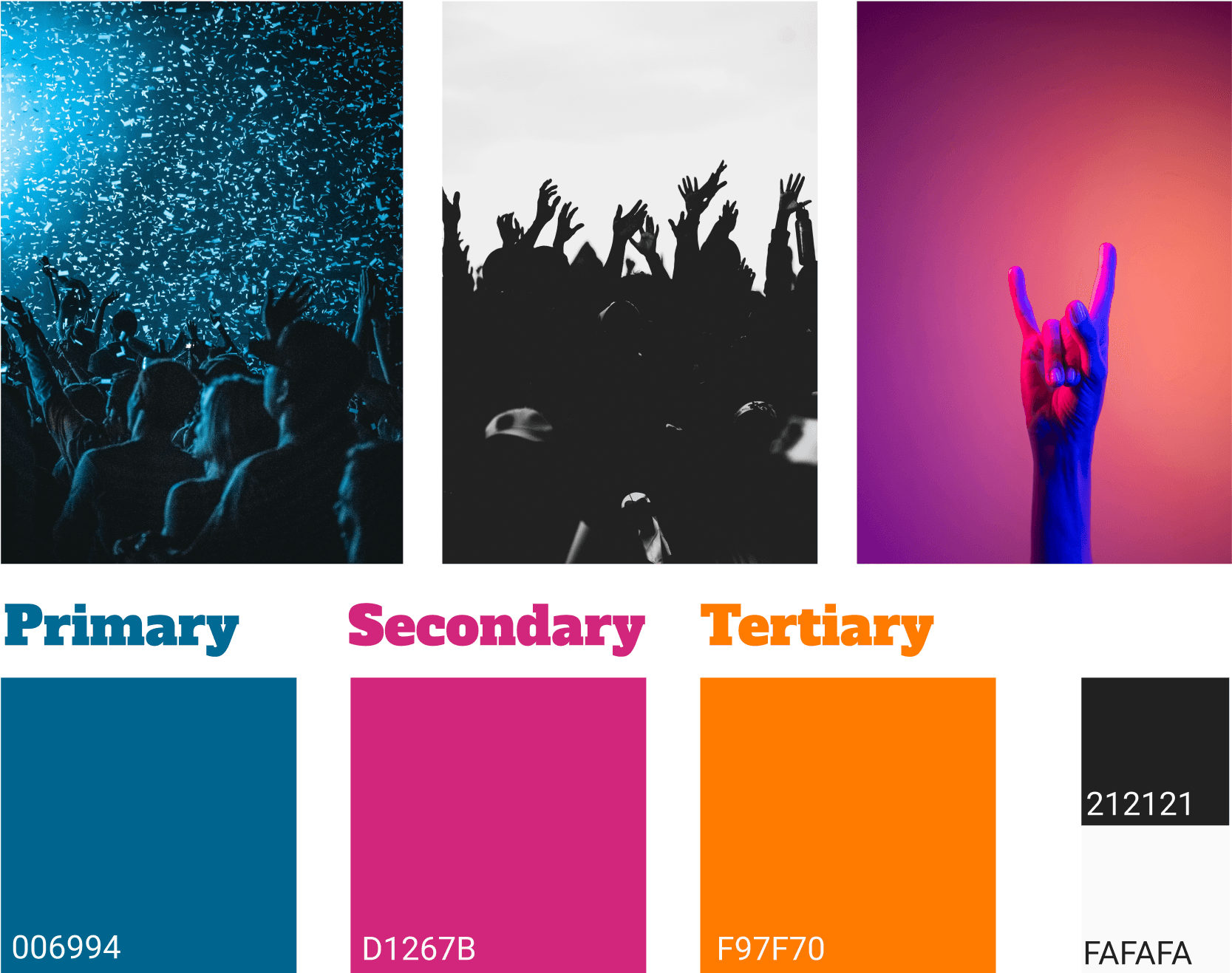
This tool was meant for friends planning trips to see live music, and I wanted it to capture a bit of that excitement. There was a lot of temptation to use big, bold colors everywhere
I chose a slightly muted blue as the main primary hue with strong accent colors.
This decision was influenced by color theory, which highlights blue as a calming color that can counteract agitation and confusion. With so much going on each screen, there was a need for balance.
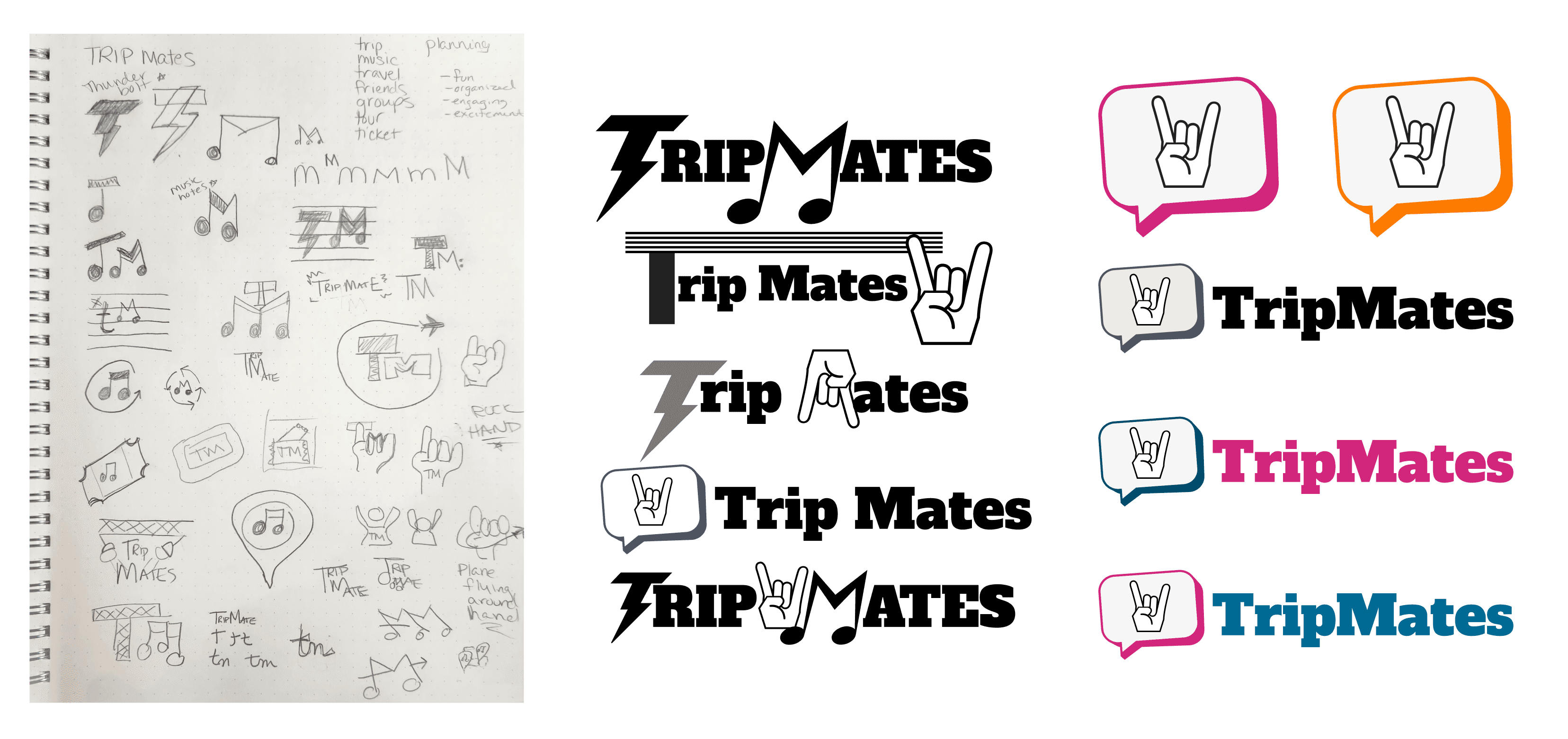
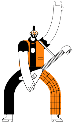
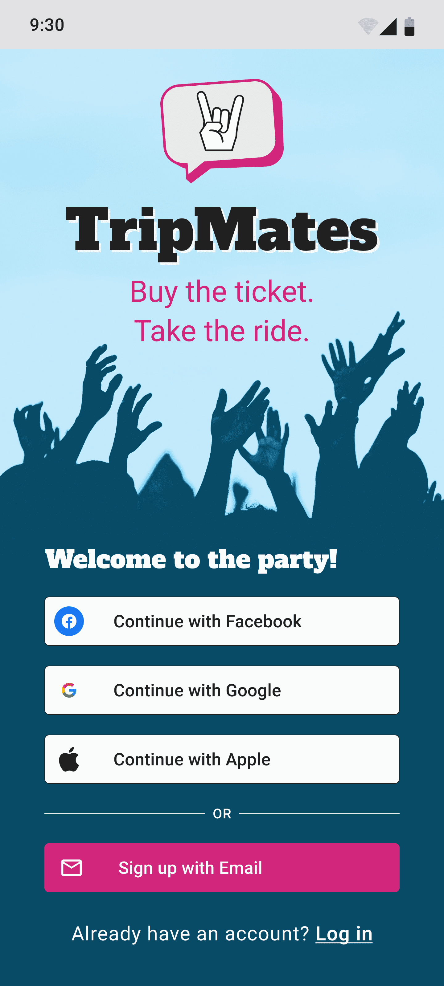
I had a lot of fun developing the name and logo for the app, as it was the perfect opportunity to let some character shine through. The challenge was to create something unique that would stand out, while also resonating with the core audience.
It needed to ‘speak to the crowd’—a design that would immediately connect with live music lovers and reflect the fun, energetic spirit of the app. Shown below is my process from Sketch > Mid-fi > High-fidelity
High-fi wireframes addressed the need for a seamless user experience by integrating interactive components, making trip planning more efficient and enjoyable, bringing the whole experience to life!
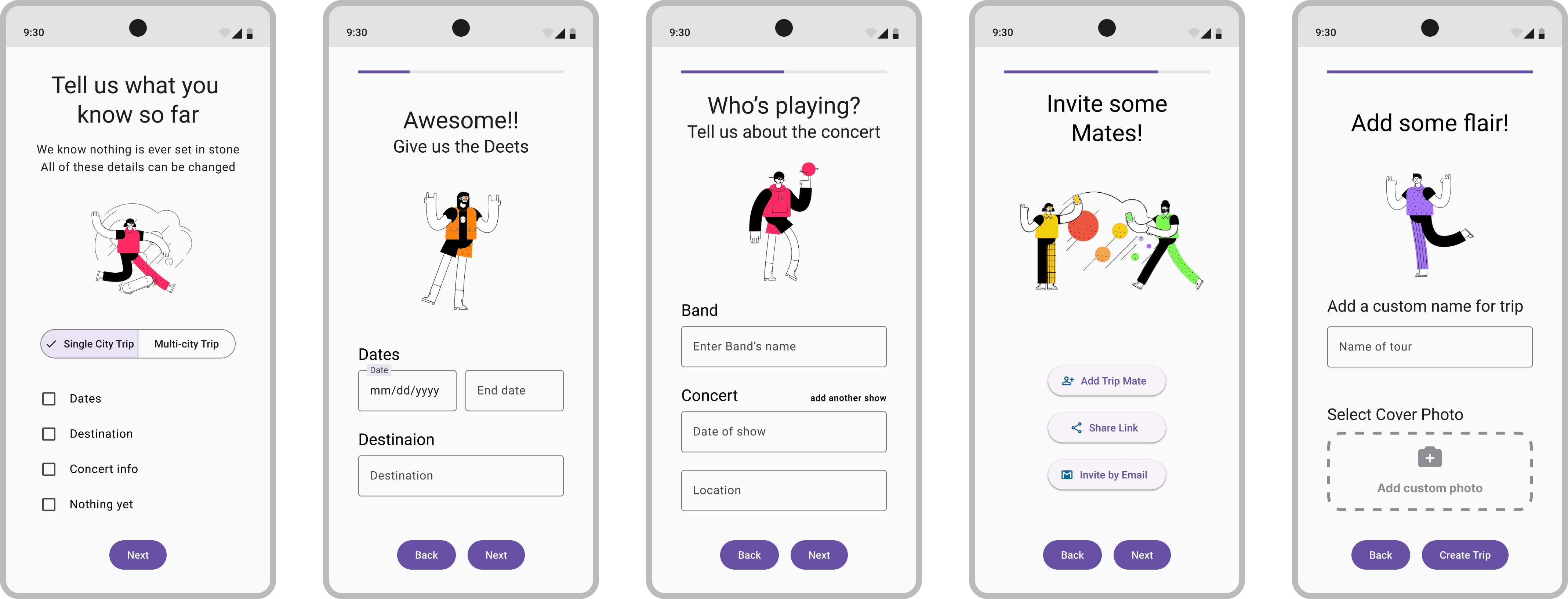
Key Tasks designed in Prototype
Onboarding & Setting up first Trip
Rock On!
Thank you
Angie!!
Starting with account setup and phone number verification to ensure security for the app's personal information.
I implemented casual language and fun graphics to create an exciting and enjoyable setup experience relating to the specific nature of these kinds of trips.
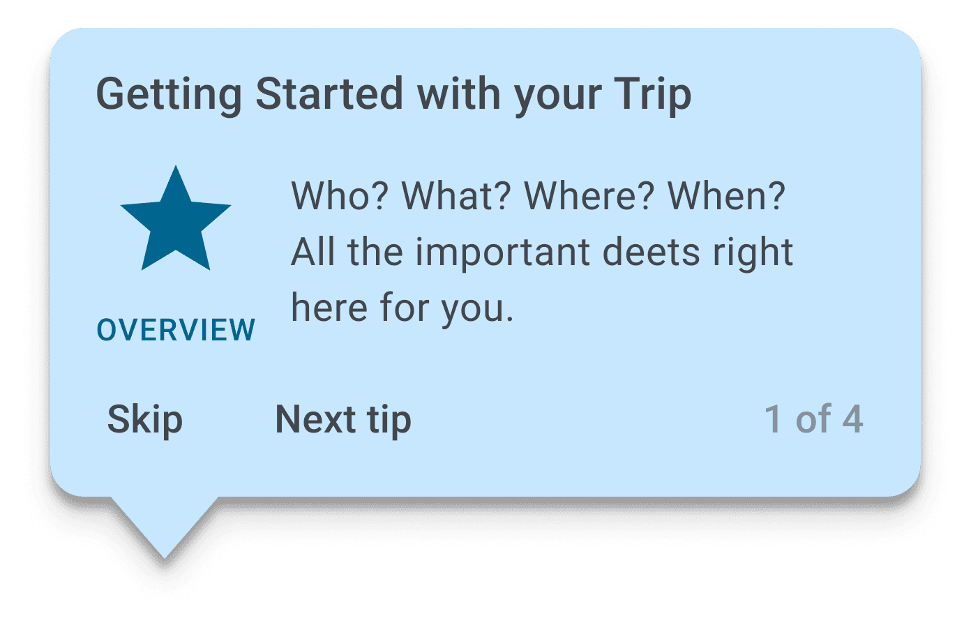
Tooltips were added for first-time users to guide them through the app's features.
The main challenge was finding the right language for each tooltip—providing enough information without overwhelming the user.
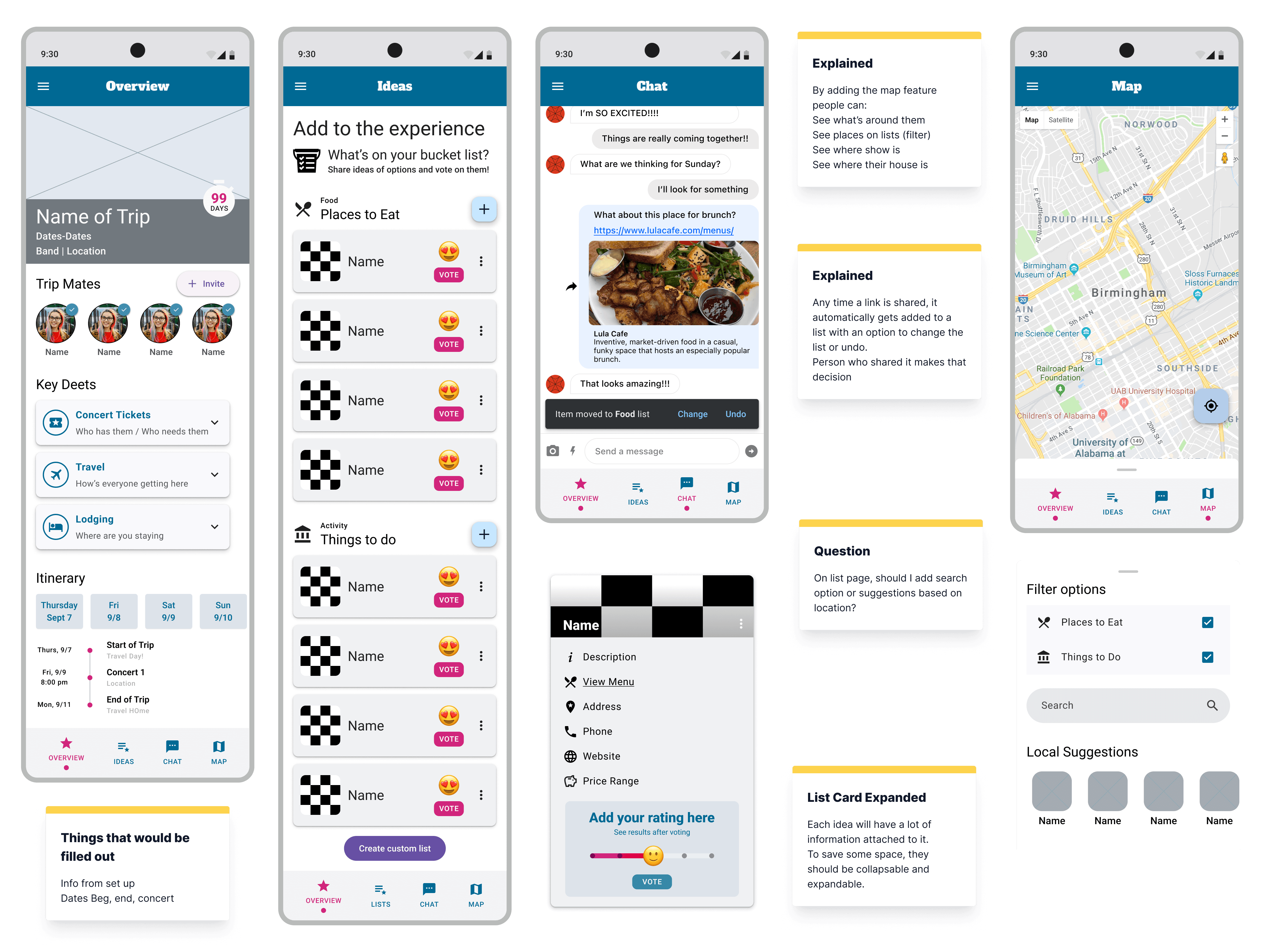
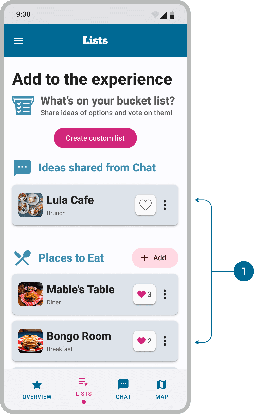
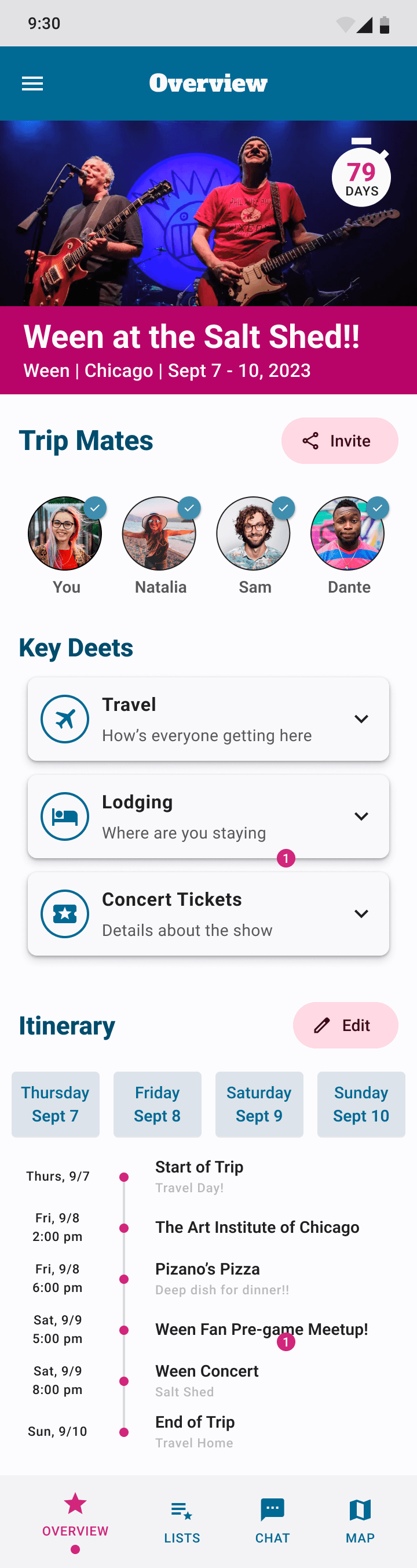
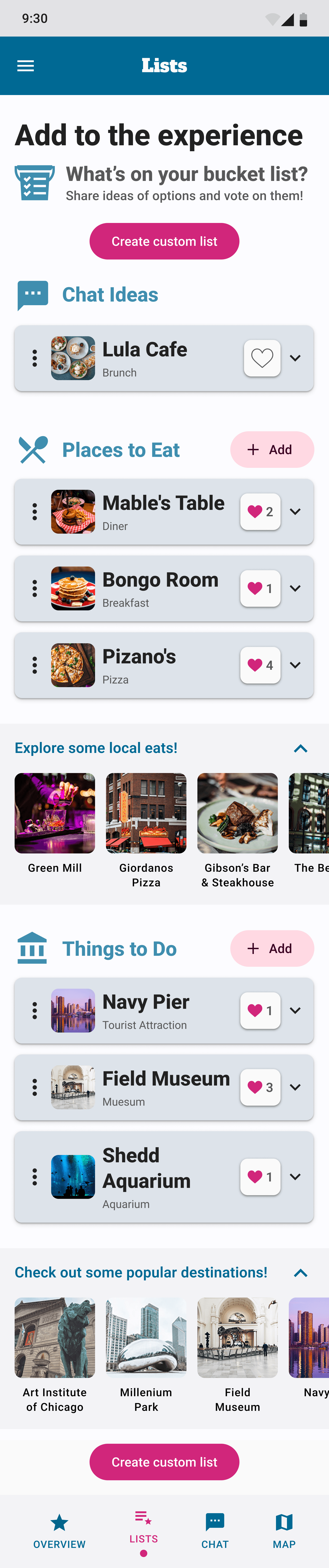
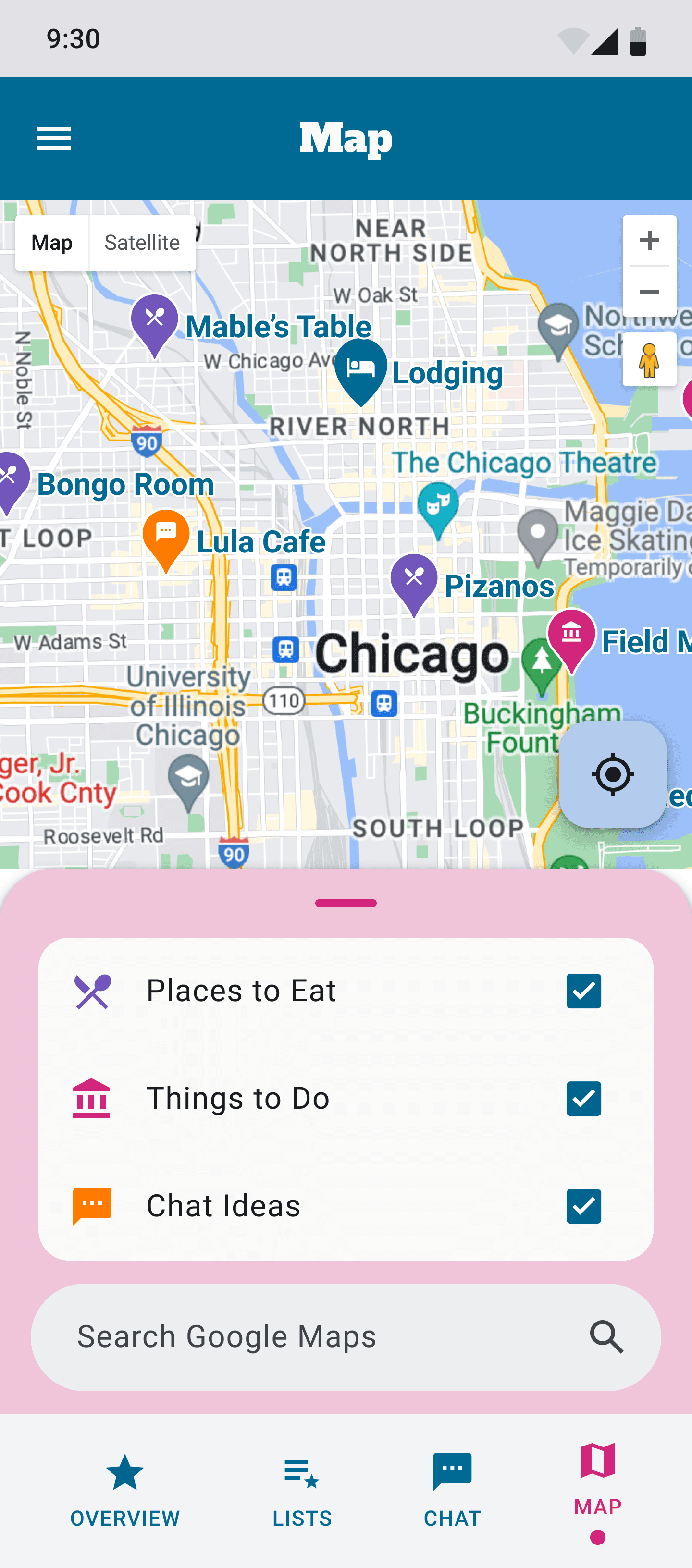
Returning to a Trip in Progress
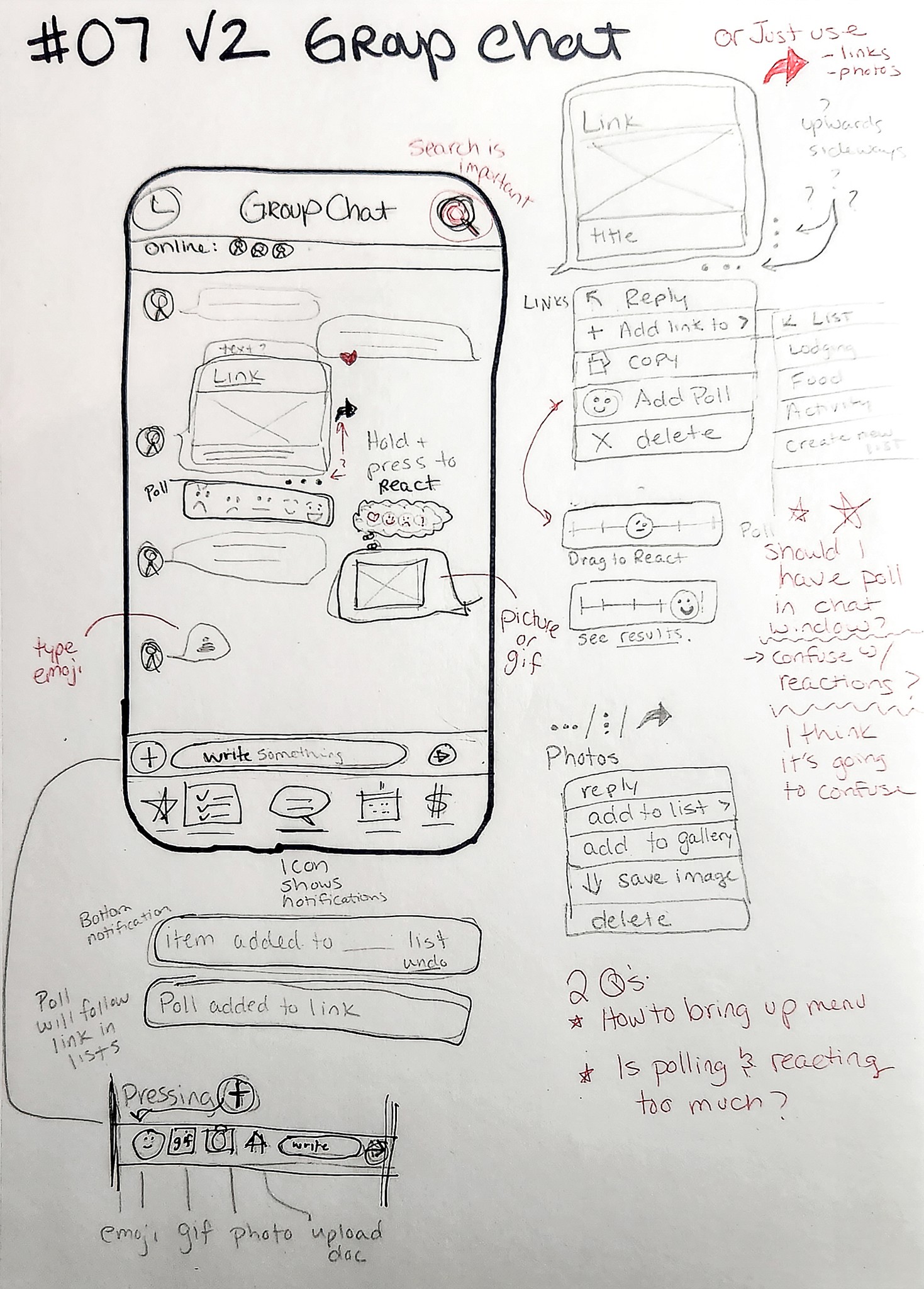
Each individual trip includes a dedicated chat for consolidating communication.
This issue tackled one of the main ones uncovered in the discovery phase.
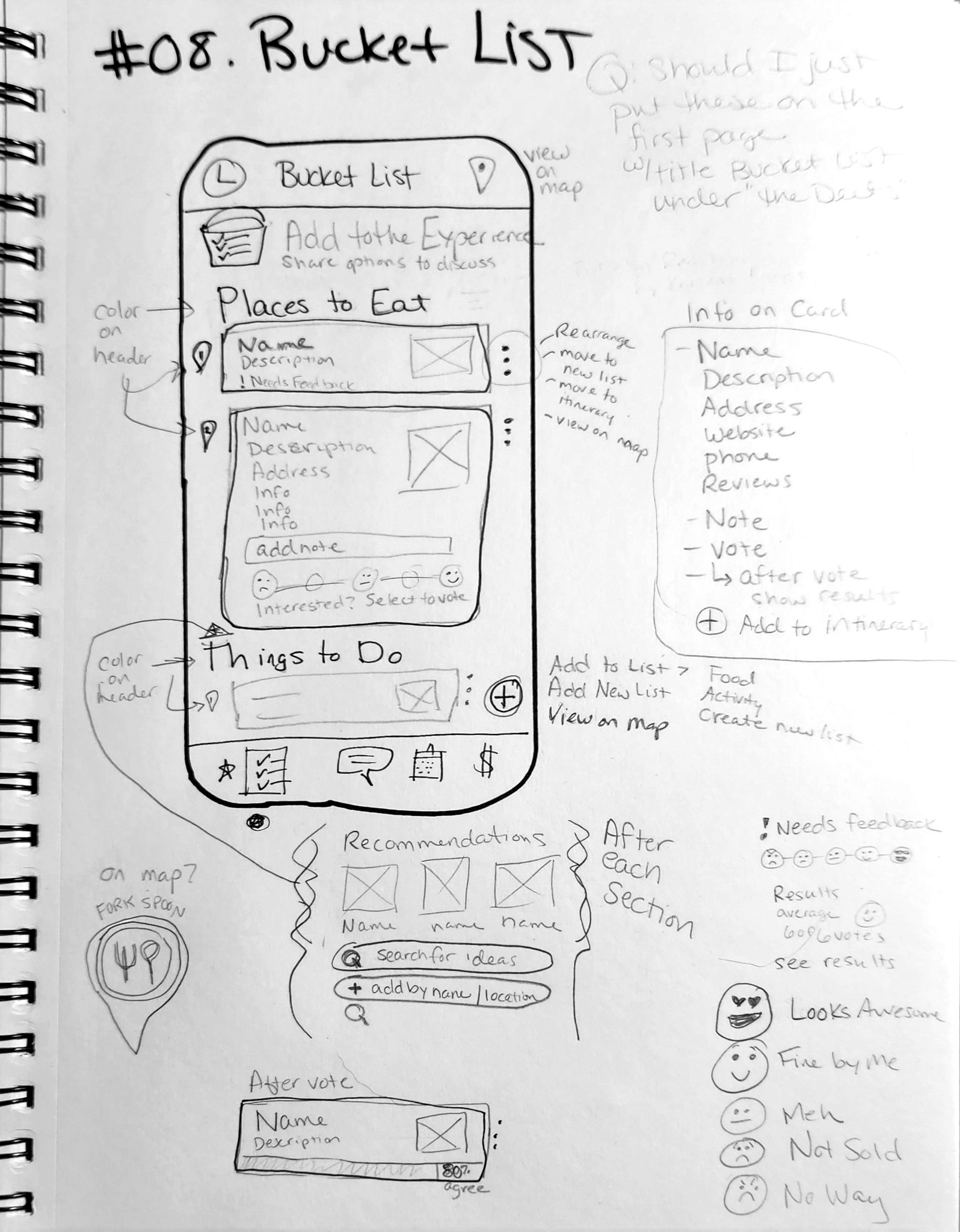
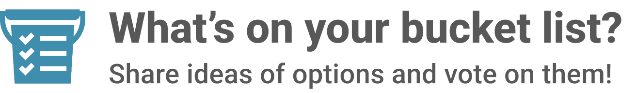
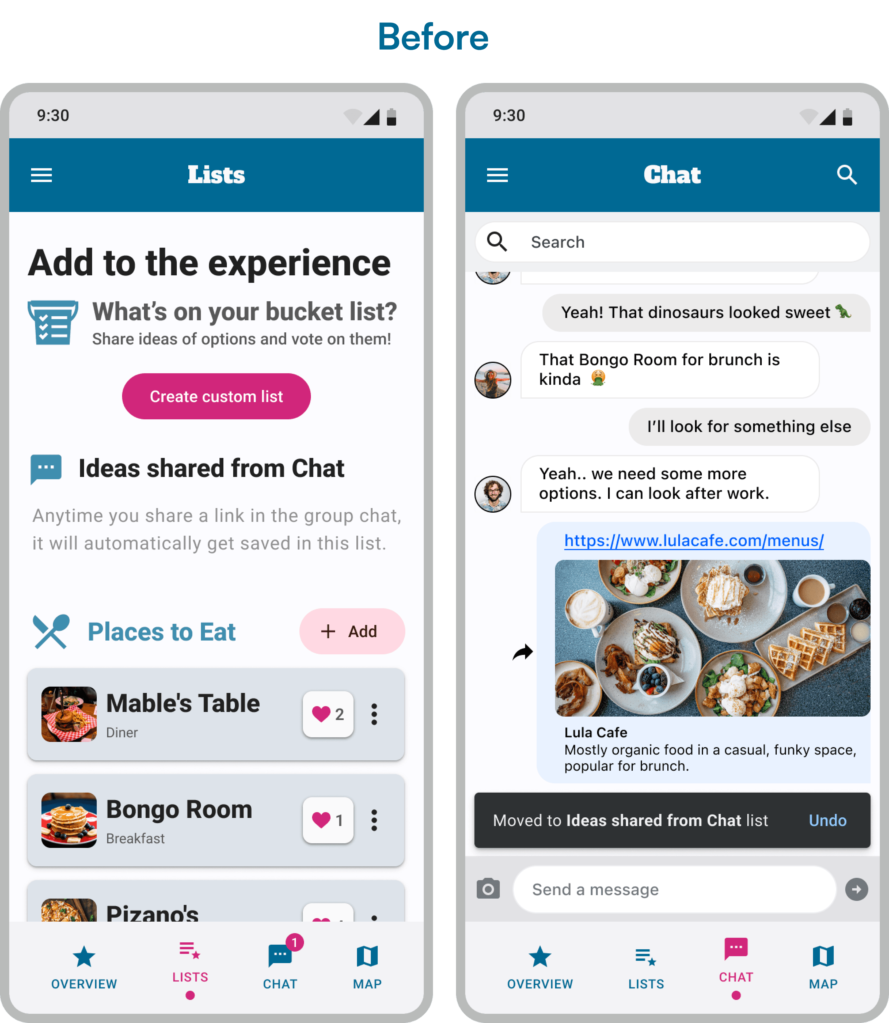
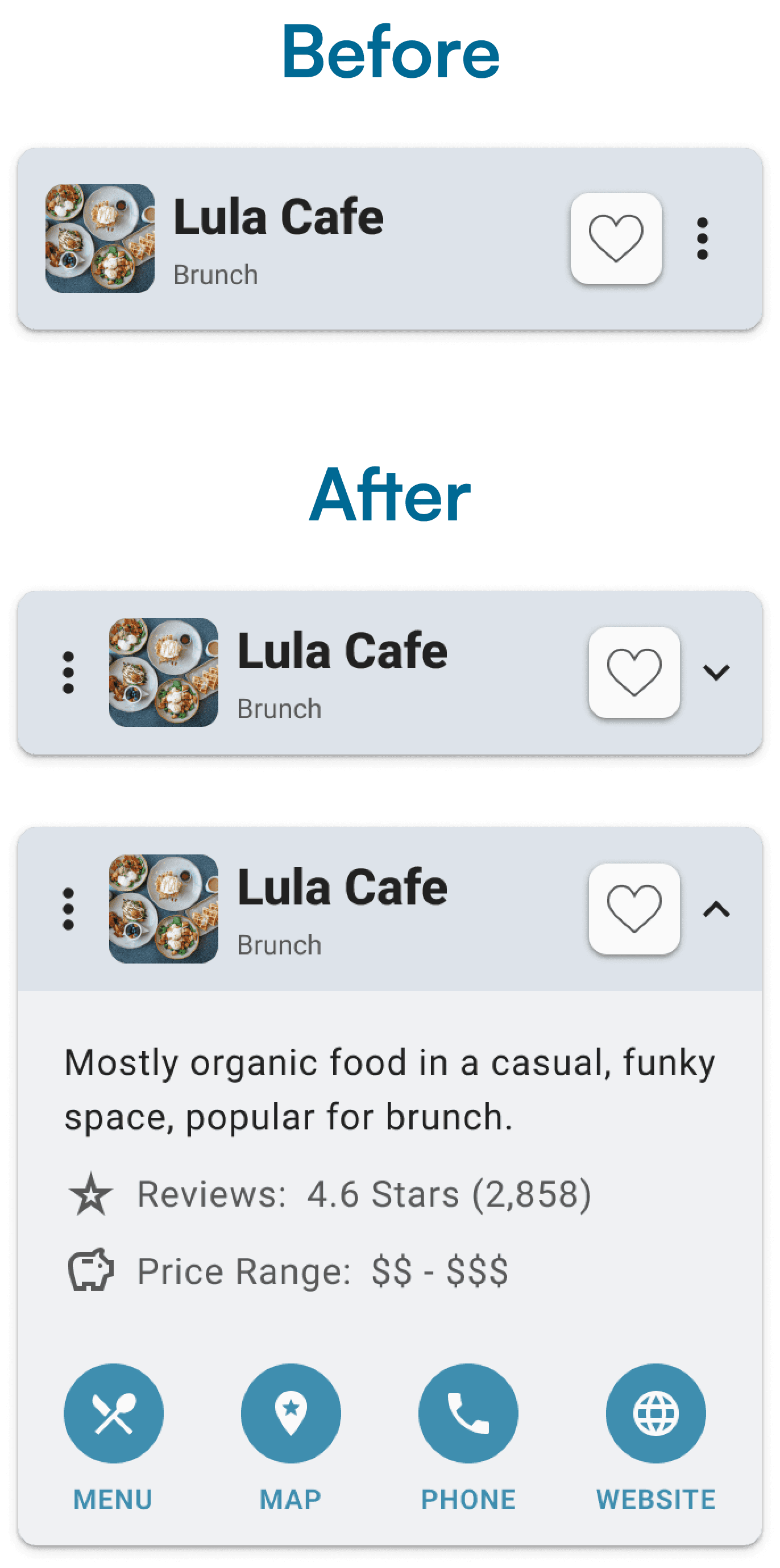
Shared links in the chat automatically appear in a "bucket list," where group members can vote and organize ideas for activities.
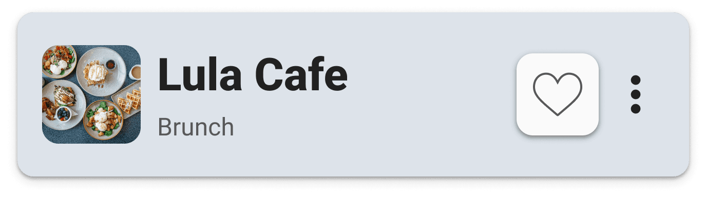
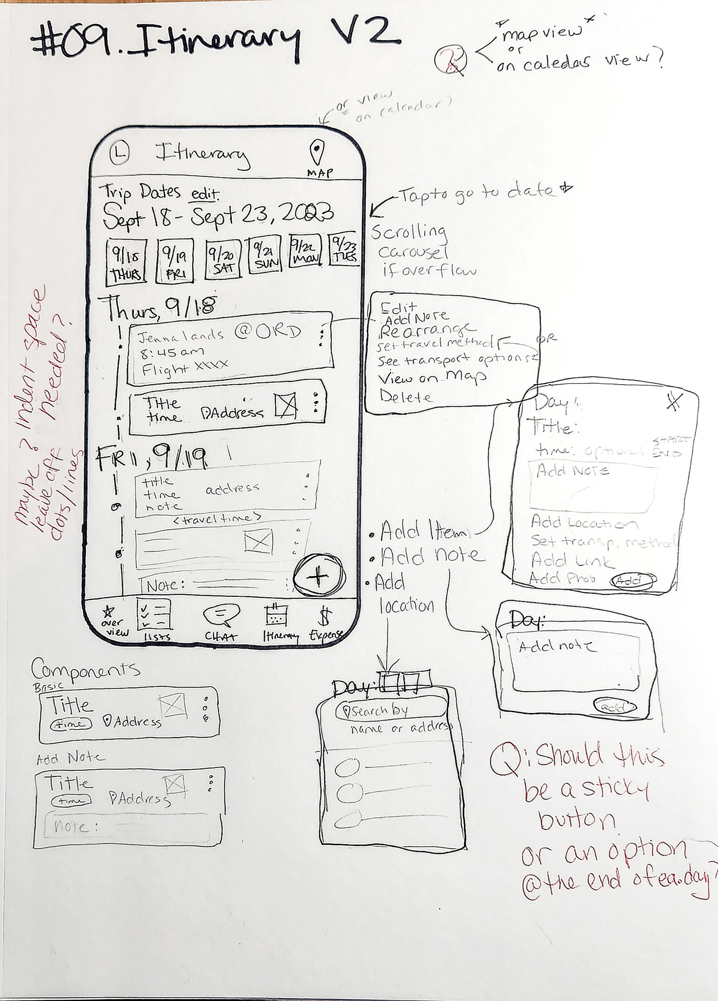
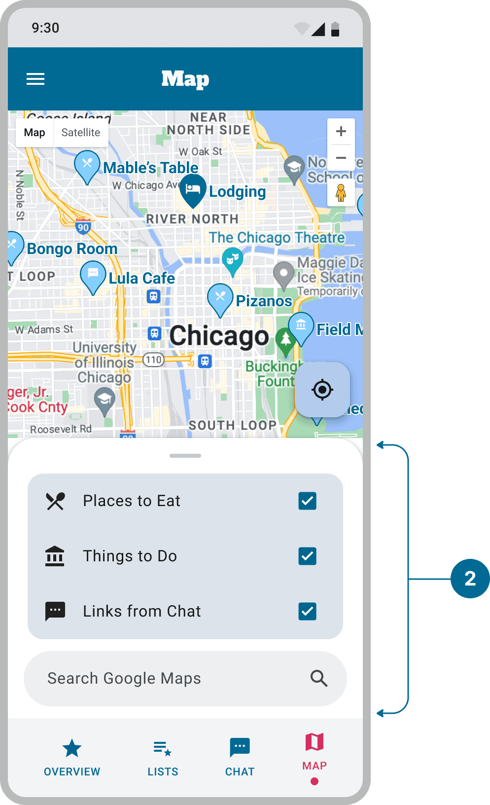
Expanded list cards show detailed information and can be easily moved to the itinerary or viewed on the map.
The main challenge was determining the optimal placement for the voting feature and understanding how different users would interact with it, all while maintaining an enjoyable user experience.
Leveraging Figma's prototyping features.. in a matter of days..
I caught on quick.. 😎
Implementing new advanced prototyping features such as variants and conditions, I created interactive components for the prototype to be used in testing. Interactive components enhanced the prototype, making it intuitive and engaging.
These new features allowed me to design AND TEST an engaging and dynamic user experience, especially for key features like:
1
Helps figure out how many people are interested in different ideas of things to do
2
Allowing control and spontaneity while planning trips on the go
Objectives
1. Testing the flow of the onboarding process
Test user’s initial interaction with the app including account setup, identity verification & setting up their first trip.
2. Test Idea Sharing and Functional Interaction
Participants returned to a trip in progress and shared an idea by posting a link in the group chat.
This included examining how the links were saved, voted on, and displayed on the map, ensuring alignment with the original project goals.
Process
Seven participants who frequently plan trips to see live music were selected.
Participants used a Figma prototype and were asked to think out loud, sharing their thought processes while completing tasks.
A Root Cause Analysis was planned to identify and prioritize any issues found during testing.
Implementing a Root Cause Analysis helps ensure that the most critical issues are thoroughly understood and effectively addressed, leading to a better user experience, more efficient use of resources, and ongoing improvement in design and development processes.
Root Cause
Impact on Real World Task
Impact Severity
Proposed Solution
Difficulty of Solution
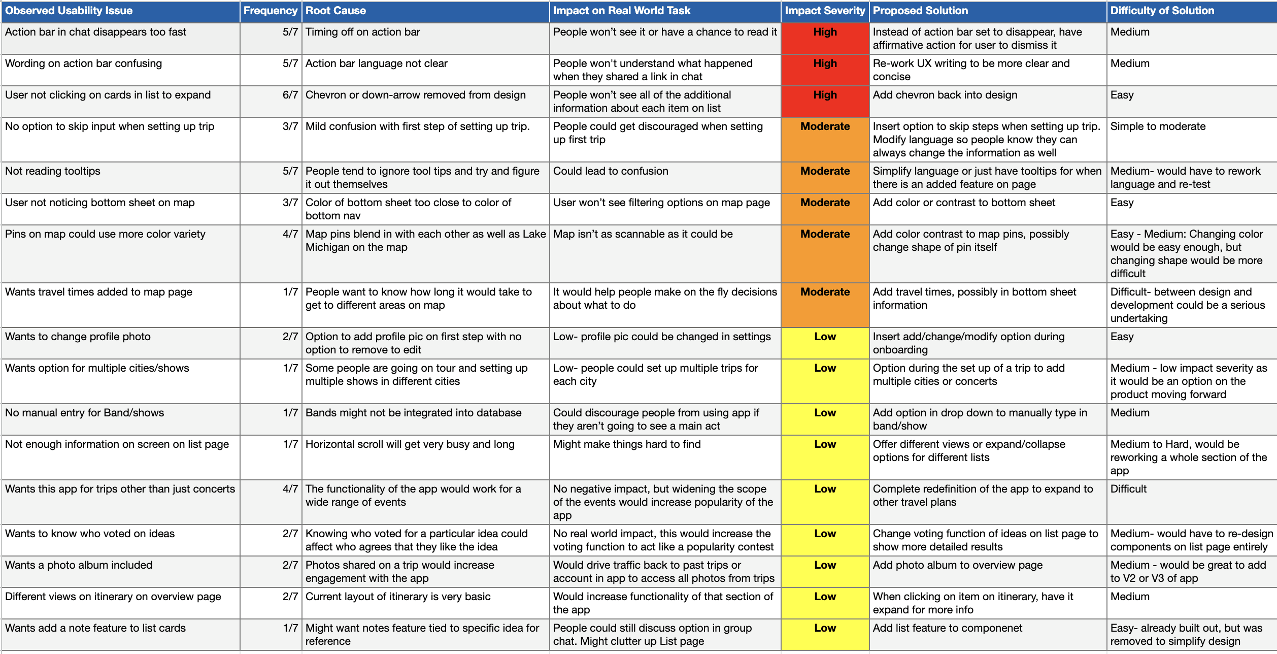
Observed usability issues broken down by severity ratings:
🔴 High - 3
🟠 Moderate - 5
🟡 Low - 9
All 3 of the ‘high’ issues were addressed in priority revisions, as well as one of the major 'moderate' issues.
Toast notification shown when link is shared from chat disappears to fast and the wording is confusing
🔴 Observed usability issue
A majority (5/7) users found the toast notification confusing and some thought it went away too fast for them to comprehend what it was saying
Result
Users did not understand how the group chat was interacting with the other functions of the app which was one of the key highlights
Root cause
Timing was off and the language was not clear
Initial recommendations
Re-work the UX writing to be more clear and concise by redefining the interaction in a way users understand
Give users the option to save to other existing lists
Lengthen the amount of time the toast stays on screen
300ms > 1000ms
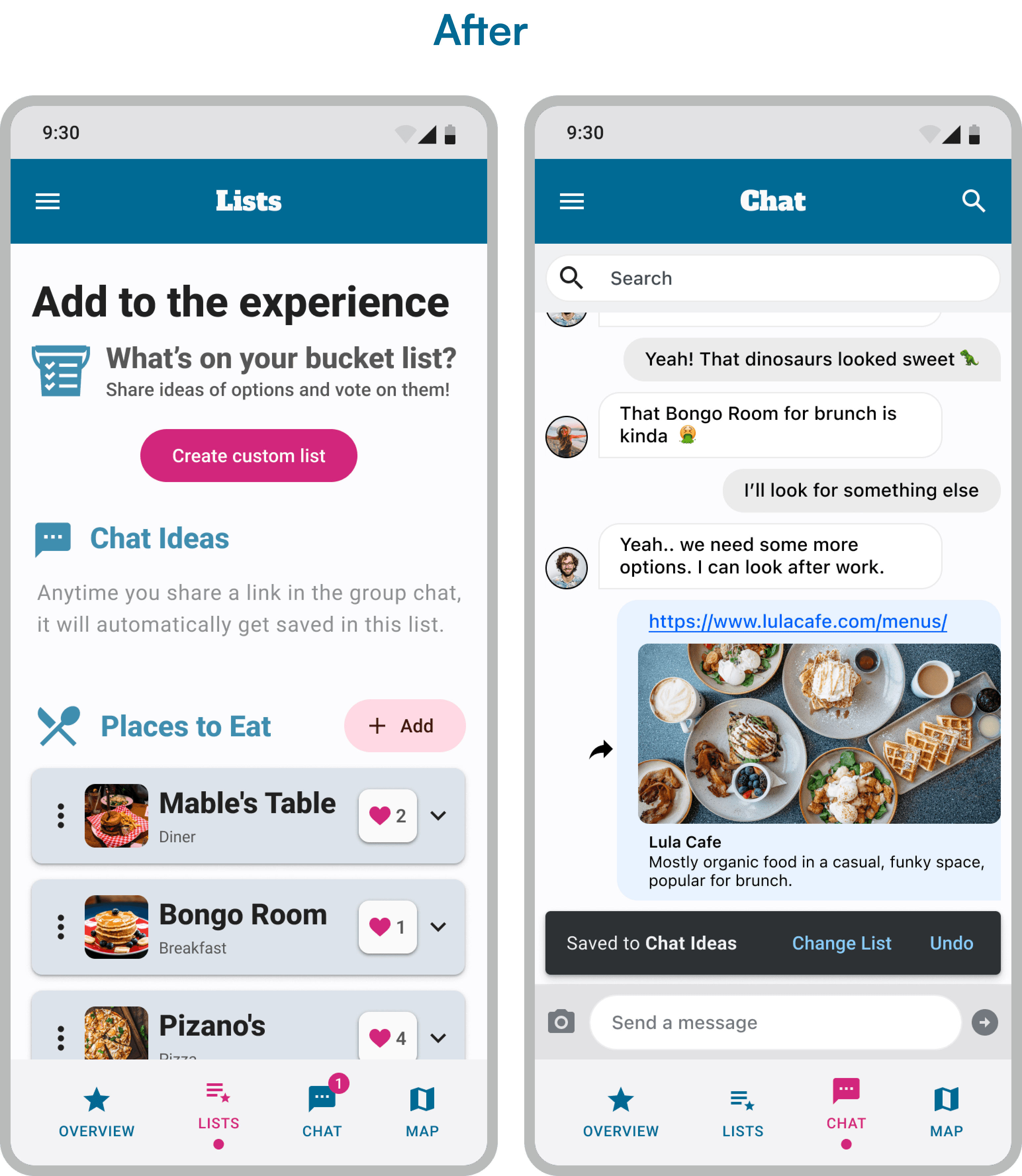
Users are not clicking on list cards to expand and show information
🔴 Observed usability issue
A majority (6/7) users did not realize that the cards on the list page would expand to show details about location
Result
Users would underestimate the value of the list section of the trip page
Root cause
The caret (or downward-facing arrow) was removed originally to maintain a cleaner interface. But in essence, the function of the card was lost without it.
Initial recommendations
Reintroduce the caret indicator.
The intent of an expandable card will be more clear
A key lesson in sacrificing function for form.
Performance Against Objectives
The final design successfully simplified trip planning and improved communication, meeting user objectives.
User feedback highlighted high satisfaction with the app's ease of use and intuitive design.
The friendly and fun tone was well-received, enhancing the trip preparation experience.
The app enhanced the overall travel experience, making it more enjoyable and less stressful.

Learning & Reflection
This case study showcases my problem-solving skills, effective communication, attentiveness to user needs, and adaptability throughout the project. Reflecting on my decisions and lessons learned, I demonstrated my ability to create user-centered designs that meet both user and business objectives.
Lessons Learned
Importance of user feedback in shaping design decisions.
Value of clear visual cues and intuitive design for user experience.
Always keep up on the latest advancements with tools & technology
Utilizing Figma's advanced prototyping features greatly sped up the design time & made the final prototype more functional for testing purposes
Areas for Future Improvements
Explore adding more advanced features, such as AI recommendations built into the app.
Further develop the expense tracking or budgeting feature based on user feedback.
Explore the potential for this app to evolve into a social platform where people traveling to the same concert can connect, hang out, and meet others with similar interests, fostering a stronger sense of community.