
Reaching a broader online community helped me gauge interest in different areas of focus.
The deets
The response
16 out of 40 people responded that they would people benefit from having a localized resource that has area-specific vendors.
CASE STUDY
This case study will walk you through how I designed Tried&True to help couples within a smaller community find local vendors while also offering them a tool for managing the entire process.
A majority of couples plan local weddings in their hometown. However, existing resources may not fully cater to couples living outside major metropolitan areas, leaving gaps in their options.
My goal was to design a wedding planning website bringing together local businesses, simplify and streamline the planning process, and ensures an unforgettable experience for couples on their big day.
Deliverables
Competitive analysis, User interviews, Personas, Wireframes, Flow diagrams, Prototype, Usability study, High-fidelity
Tools Used
Figma, Figjam, Google Sheets Sync & Zoom
Roles
UX/UI Designer
UX Researcher
I’ve been working as a wedding photographer for over 15 years in Northeast Ohio.
Let's be real—I've seen my fair share of blunders and mistakes, enough to fill a book. Most, if not all, can be traced back to poor planning and communication issues. I have spent years listening to people's desires and needs, all the while determining the optimal approach to harmonize them with realistic and obtainable goals.
I applied these skills into my Research Plan: Understanding what resources people use and how information can be organized and presented to make the entire process less stressful and more enjoyable.

16 out of 40 people responded that they would people benefit from having a localized resource that has area-specific vendors.
I interviewed five brides to hear their personal story about how they planned their wedding day.
What their priorities were when picking vendors
What tools they used to keep everything organized
I used my usual ice breaker question when meeting potential wedding clients: “Tell me about how the two of you got engaged.”
Wrong move. This prolonged the interview an additional 20-30 minutes without providing relevant insights for the project.
By centering the rest of the interview on the planning stage and while still keeping the conversation open-ended, I identified patterns and gained key insights crucial for guiding the project.
More conventional brides found major wedding websites user-friendly and helpful
Conversely, less traditional brides avoided large wedding sites, preferring a DIY approach
Stress levels soared when brides overloaded themselves with wedding day responsibilities
Picking the location of the venue was a first priority
Most other vendors were chosen because of their proximity to their venue
I explored the top two wedding planning websites of 2023, creating accounts as a bride from my hometown in Ohio to examine their onboarding processes and services.
TBH, they are pretty great
While they offer a LOT of resources and tools to help couples plan their day.
There was a lot to learn about how to see how information can be categorized and laid out.
Location! Location! Location!
Vendors pay for placement on recommendation lists, leading to distant companies appearing at the top, while local businesses are often buried or omitted entirely.
Brides with ample resources can easily access many effective tools for grand wedding schemes.
However, those desiring a less extravagant, more personal and potentially DIY style struggle to find adequate help and would greatly value a site geared towards smaller-scale needs.
She wants to find vendors in her hometown where she wants to get married
She wants to simplify the process and scale the event down to focus on what really matters to her and her fiancé.
She’s hoping to have friends and family help her on the “day of” so she does not feel overwhelmed
She knows where she wants to get married, but needs to find other local vendors that will work with her for a scaled down event.
She needs some help organizing tasks to delegate to other people to ensure a stress-free day.
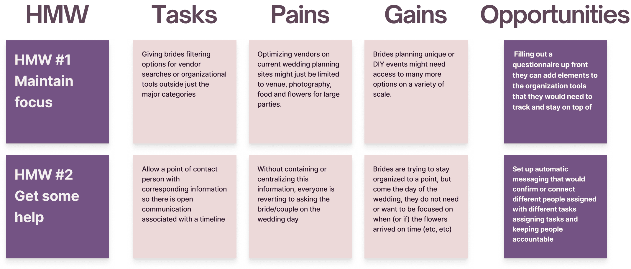
By creating How Might We (HMW) statements and turning observations into questions, this provided me with targeted ideas to explore.
Then by reframing the problems into opportunities using a JOBS TO BE DONE method, I established some constraints that helped me focus creating a site as a whole.
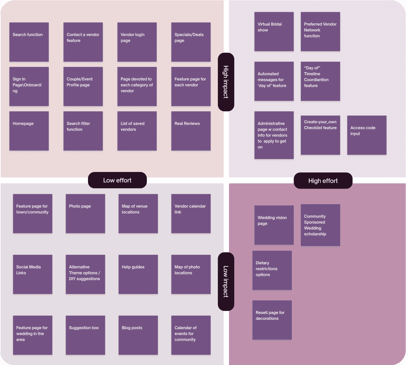
To create a clear structure for the website, I worked on a Feature Roadmap to prioritize features for development focusing on creating a simple, streamlined, and enjoyable experience for the user.
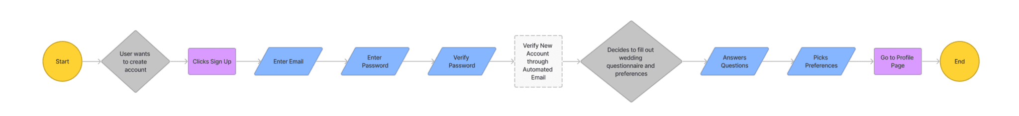
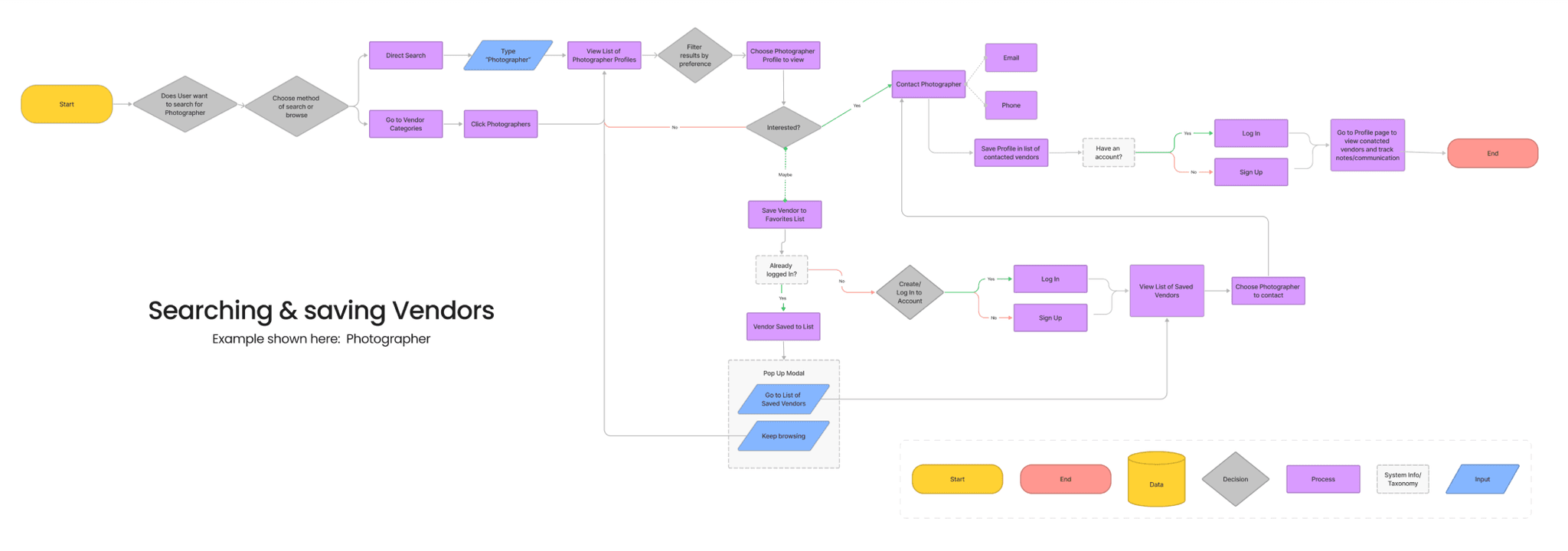
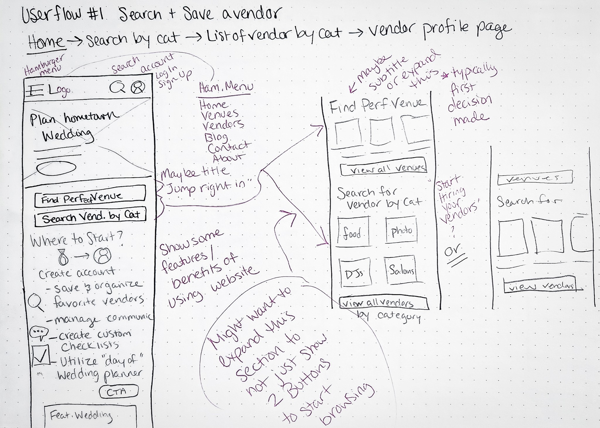
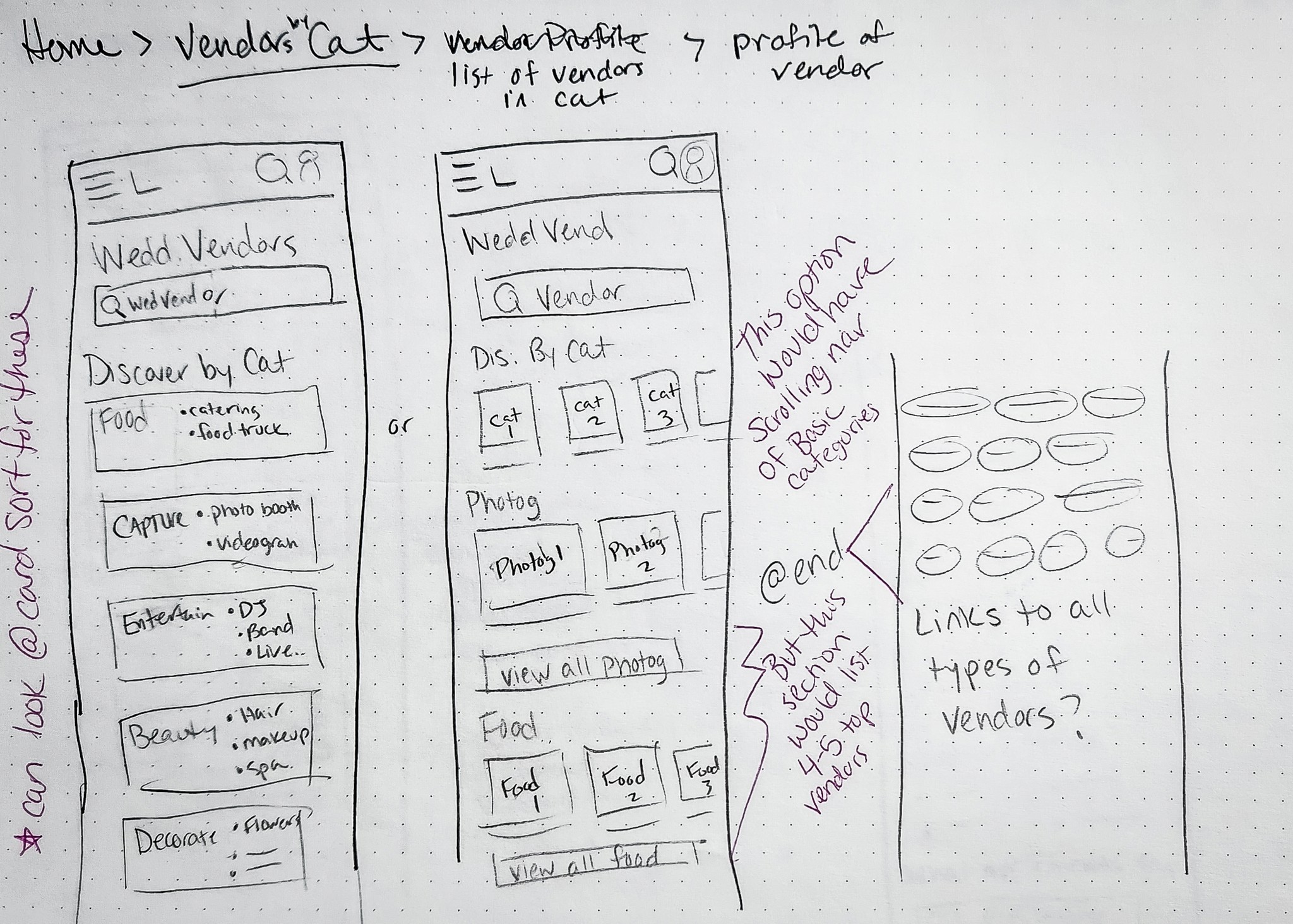
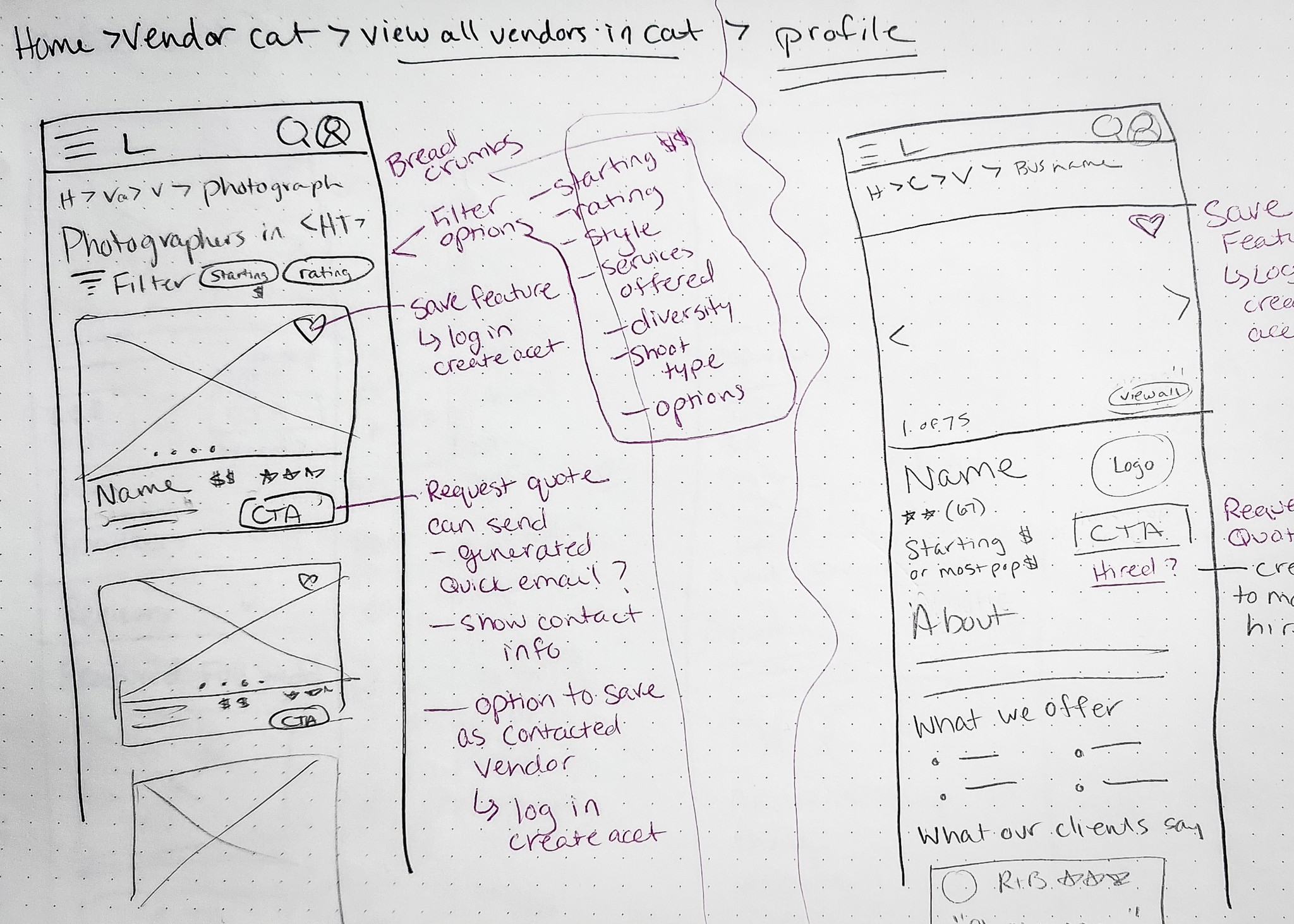
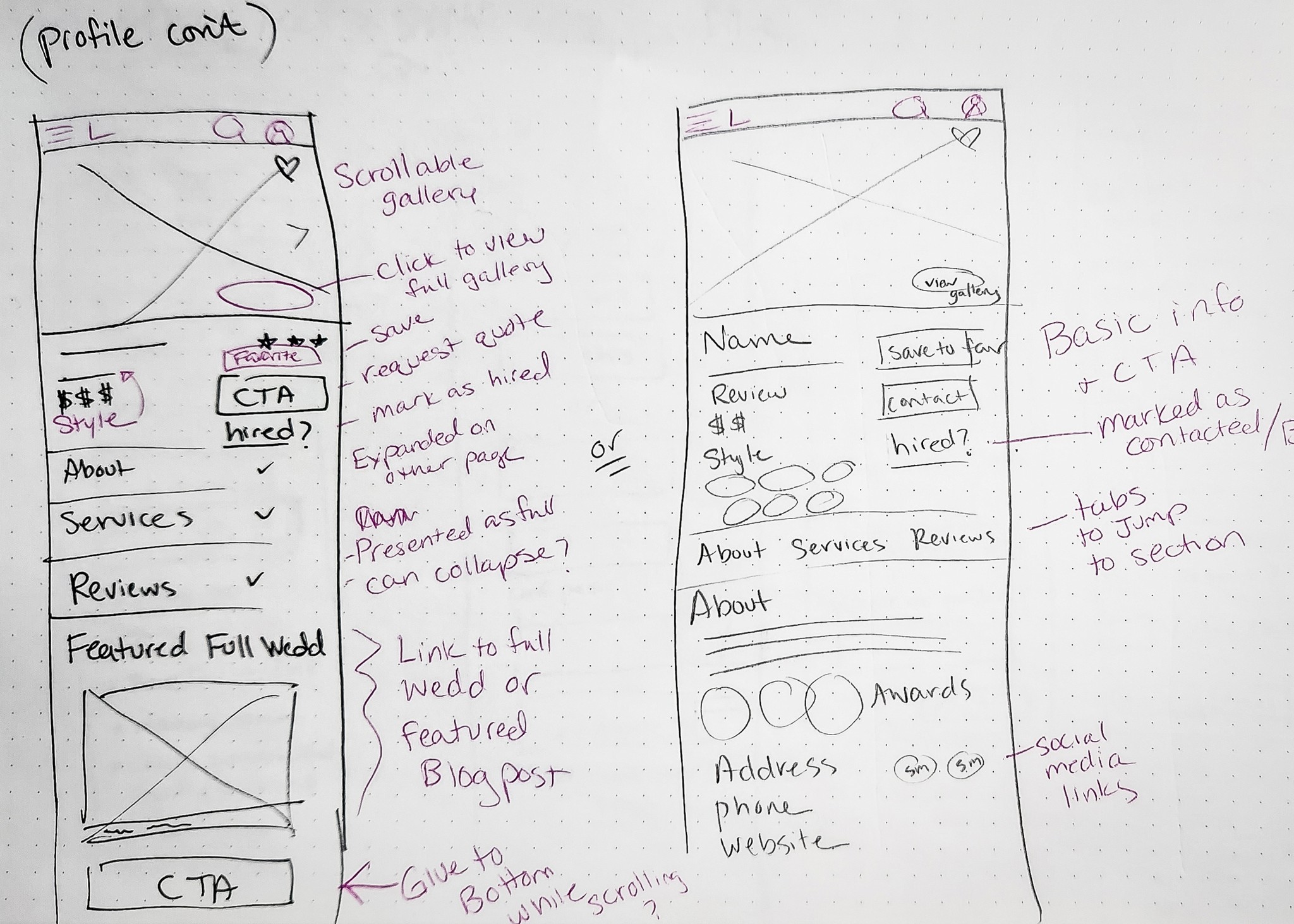
After creating a sitemap to structure and organize the site's taxonomy, it led me to design two user flows related to the main project goals.
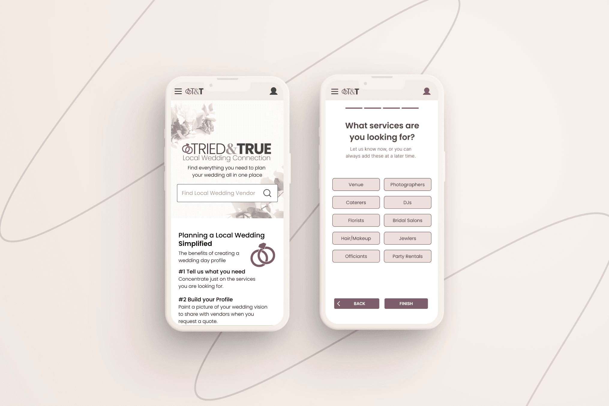
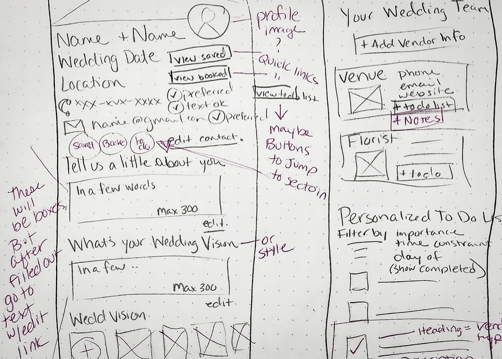
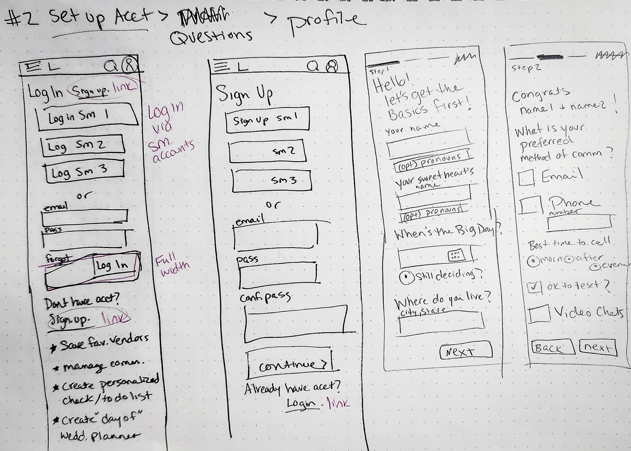
One flow was focused on account creation and onboarding, aimed at providing a simple, customizable experience through a short questionnaire that helps users specify their needs and organize their planning process.
The second flow focused on searching, saving, and contacting vendors, addressing the challenge of navigating through the vast amount of content and providing an easy, accessible path to finding and saving preferred vendors.
These sketches allowed me to quickly experiment with different designs & determine what might work and what wouldn't.
Presenting my sketches in group critiques and discussing in weekly mentor sessions, I was able to develop my skills in articulating my designs and learn to work with constructive feedback.
At this stage in my design journey, I was still getting the hang of Figma. Auto-layout, components, styles, and variables were all brand new to me. But what I did know was Design Patterns, so I leaned on that knowledge.
Using the user flows from the previous exercise as a guide, I focused on what each screen needed and designed the project pages, making the most of what I knew while learning the rest as I went.
Progressing to mid-fi wireframes provided a refined the visual design of the site as well as ensuring that all the flows required would be completed for testing.
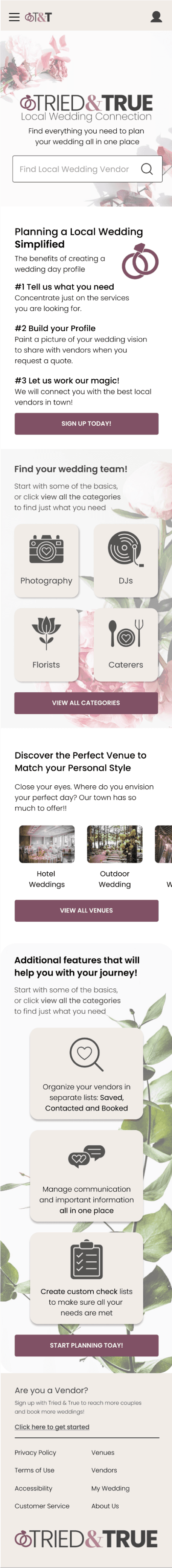
The onboarding process was designed to collect just enough information to share with vendors & set up an initial wedding page.
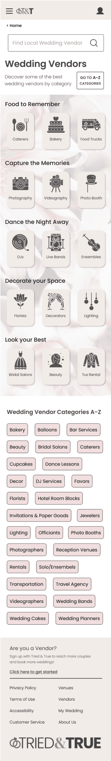
With so much content to organize and categorize, making thoughtful design decisions at this stage was crucial. My goal was to ensure users wouldn’t feel overwhelmed while still providing enough details for them to make informed decisions.
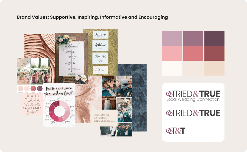
During the branding and interface design phase, I carefully considered the visual direction of the product. After selecting a color palette, typeface, and logo, I was able to give the website a distinct identity.
This process helped me align the visual aspect with the core values established earlier in the project, starting from the user research phase. Ultimately, I aimed to create a warm and welcoming feel for the website with a touch of modern flair.

Translating a user flow into a high-fidelity wireframe is one thing, but bringing it to life as a prototype brought a whole new level of understanding the user experience.
This allowed me to fully immerse myself in the user's shoes, doing by best to ensure that the journey is straightforward and effortless for the end user.
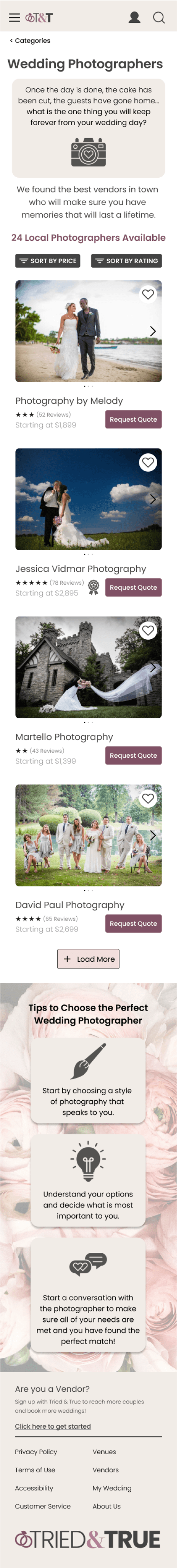
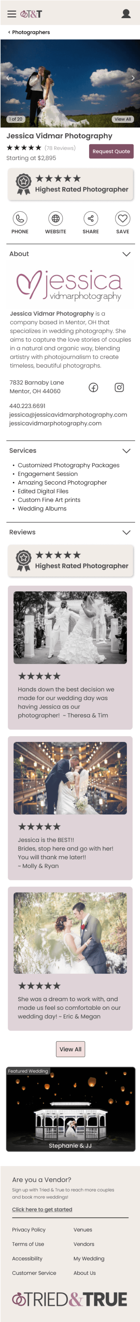
The primary goals of this usability study was to evaluate the website's user experience by observing how participants navigated to different vendor categories and gathering feedback on the onboarding process.
This study aimed to identify potential usability issues and assess the site's effectiveness in meeting user needs.
Participants were instructed to:
Start at the homepage.
Navigate to a specific vendor category.
Select a vendor based on their requirements.
Complete the onboarding process.
Finish on their personalized "My Wedding Page."
The study included six individuals who had either planned or were planning a wedding and had experience searching for vendors online.
Users provided positive feedback, expressing that they understood the website's value and would enjoy using its features.
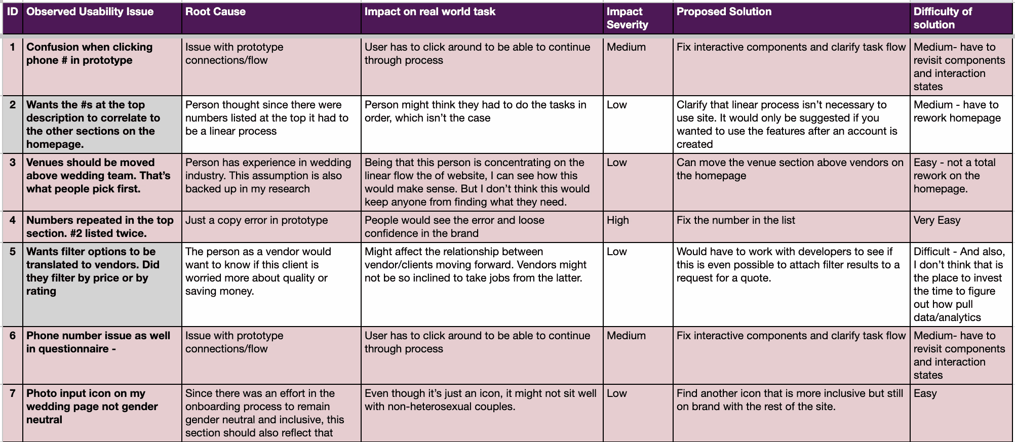
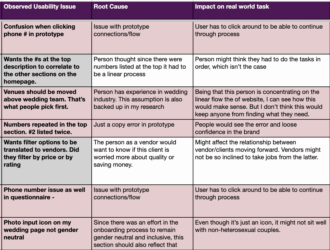
Implementing a Root Cause Analysis helps ensure that the most critical issues are thoroughly understood and effectively addressed, leading to a better user experience, more efficient use of resources, and ongoing improvement in design and development processes.
Root Cause
Impact on Real World Task
Impact Severity
Proposed Solution
Difficulty of Solution
Implementing a Root Cause Analysis helps ensure that the most critical issues are thoroughly understood and effectively addressed, leading to a better user experience, more efficient use of resources, and ongoing improvement in design and development processes.
Fix Glitches
Address minor prototype glitches, such as phone number input, "still deciding" option during onboarding, and sequential number mismatch on the home page (low effort).
Sign-up Functionality:
Repair broken Facebook/Google sign-up links.
Home Page Updates:
Move "Venues" above the "Wedding Team" section, aligning with user preferences from initial interviews.
Wedding Profile Page:
Update non-gender-neutral icons for inclusivity.
Add a notifications badge to the To-Do list icon.
Photographer Category Page:
Change "Filter by" to "Sort by" and nest the search bar icon in the header to simplify navigation.
Add a "Budget" Feature
Implement a budget tool to help users track and manage wedding expenses, a request from 2 out of 6 users.
Expand To-Do List Options
Offer more ways to view the to-do list, such as a calendar view or task countdown, to improve task management.
Profile Completion Progress Bar
Create a progress bar on the "My Wedding" page to guide users through completing their profile, including bio, wedding vision, photos, and budget.
This was my very first UX project. I know, maybe I shouldn't have mentioned this. But I learned so much and really fell in love with this process. Grasping the concept that before you start, think about where you are going & why you are doing it, speaks to me in so many ways. I always told my clients, "I'm nothing if not over-prepared." This is just who I am.
Taking the time, doing the work, discovering a problem and figuring out the best way to solve it.. this is what I can do. This is what I'm going to be great at.
When talking with people for user interviews, I learned a hard lesson when it came to time management and focus. Moving forward on other projects, I worked much harder on defining Goals and Objectives in my Research Plan
I surprised myself when it came time to design screens. As a new designer, learning auto-layout and Figma within a matter of weeks was a huge boost in confidence.
Overall, I feel like it was a huge accomplishment. As a career transitioner, I was able to learn new skills and apply them in a ways I never knew I was capable of, in a relatively short period of time.
Coming from the wedding industry myself, I had a deep commitment to helping couples find vendors that fit their needs. Weddings are stressful. I just wanted to find a way to make it better.
While I may not have the flexibility to always choose the focus of my work. I will always go at it with the same enthusiasm as this one.